Metrics Evolution Reports
This type of report allows you to analyze the evolution of a specific metric over time on one or more monitored devices. They compile and present historical values within a defined period, showing trends, anomalies, and changes in behavior.
The user can configure the metrics, time range, devices, and sampling frequency. The report includes graphs, tables, and statistics (averages, maximums, minimums, etc.) and can be exported or scheduled for automatic generation.
The following details the process for creating and running reports, establishing a series of filters and parameters customized by the user.
Configuration and generation of Metrics Evolution Report
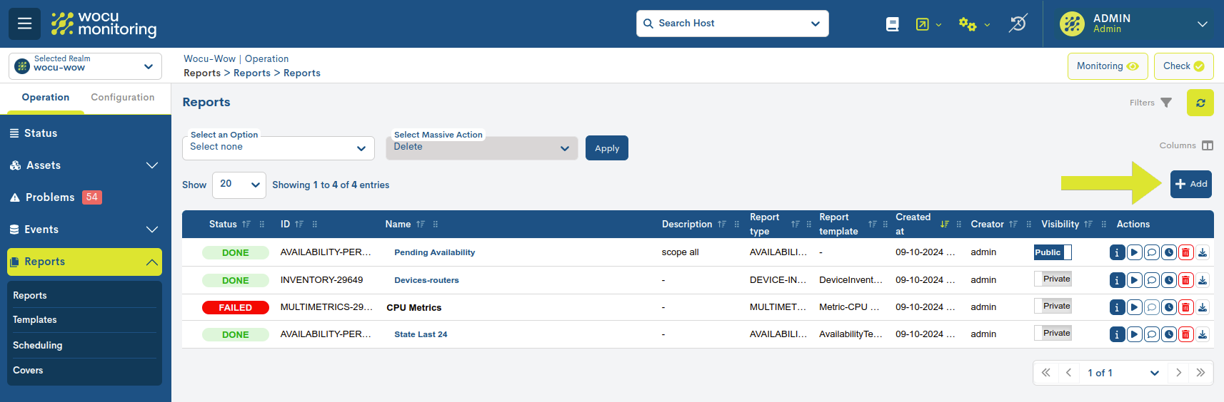
Generally, when creating reports, the user should access the blue + Add button, located within the Reports section.
Before generating the report, you will need to configure a series of parameters described below:
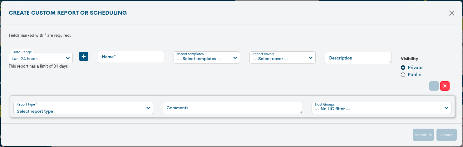
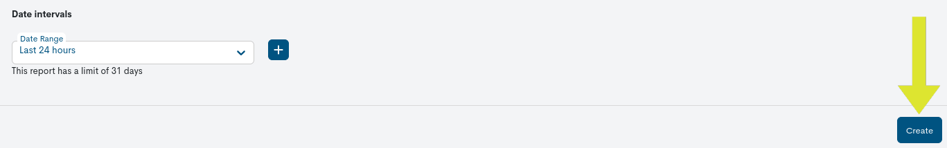
Date range
This parameter establishes the time period for which the Availability calculation will be performed.
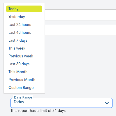
There are a number of time criteria already in place:
Parameter |
Description |
|---|---|
Today |
filters and displays only events generated during the time period elapsed in today’s day. |
Yesterday |
filter and display only data recorded yesterday. |
Last 24 hours |
filters and displays only data recorded in the last 24 hours. |
Last 48 hours |
filters and displays only data recorded in the last 48 hours. |
Last 7 Days |
filters and displays only data recorded in the last seven days. |
Last 30 Days |
filters and displays only data recorded in the last thirty days. |
This Week |
filters and displays only data recorded during the time period elapsed in the current week (from the start day of the week to the current day). |
Previous Week |
filters and displays only data recorded in the previous full week (Monday to Sunday). |
Last 30 days |
filters and displays only data recorded in the last seven days. |
This Month |
filters and displays only data recorded during the time period elapsed in the current month (from day 1 to the current day of the month). |
Previous Month |
filters and displays only data recorded in the previous full month (day 1 to days 28/30/31). |
If you want to define a specific time period, you can use the Custom Range option. To configure the time range, you must specify a start and end date. Clicking on a day will select it and highlight it with a blue background. In addition to the date, you can specify a specific time within that day using the drop-down menus for hours, minutes, and seconds, until you reach the exact moment you want. The selected date and time will be displayed in both the upper and lower boxes of the view.
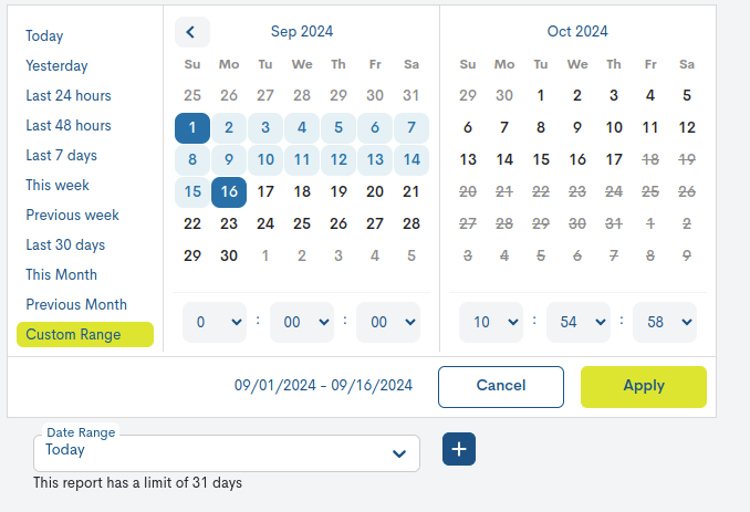
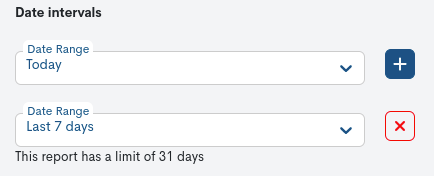
Using the plus sign (+) button, you can add multiple date ranges for data collection in the configured report. If you want to delete one, simply press the red button with the cross (X). The range will disappear, and when you run the report, only the remaining periods will be taken into account.
Attention
It is of course not possible to choose start and end dates after the current date, nor to set an end date before the start date.
Name
Required field to record a report identifier term.
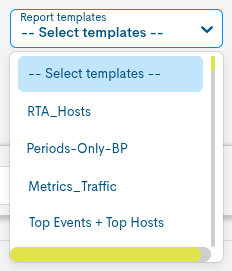
Report Template
In this optional field, the user can select the template they wish to apply to the report. Templates are pre-created and available for reuse during report configuration. More information can be found at: Templates.
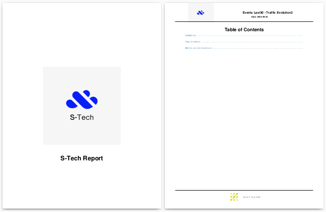
Report Covers
In this optional field, the user can choose a predefined cover for the report. This includes a cover image, a header on the pages, a main title, and a footnote. This gives documents a corporate and professional appearance, tailored to the organization’s visual identity. More information can be found at: Covers.
Description
Optional field where the user can include descriptive text related to the report.
Visibility
In this field, the user will determine whether the report will be visible to other users (i.e., a public report, Public), or whether it will be private and visible only to the report’s creator (Private).
Report Type
In this drop-down field the user must select the type of report he/she wishes to create, in this case it will be Metrics Evolution.
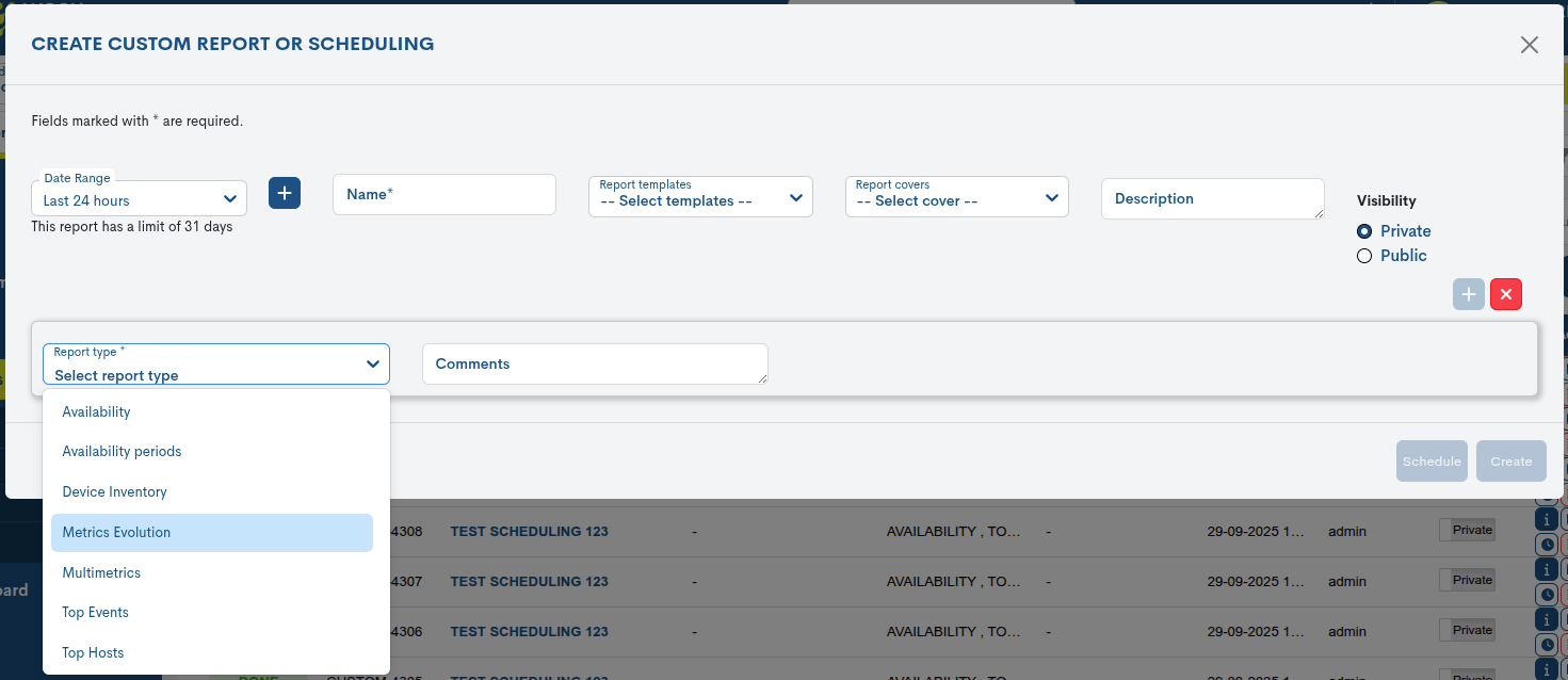
Note
Depending on the type of report selected, new fields to be defined will be automatically included.
Host Group
This configuration parameter allows you to filter the data collected and reflected in the report, showing only data related to the Host Groups existing in WOCU-Monitoring.
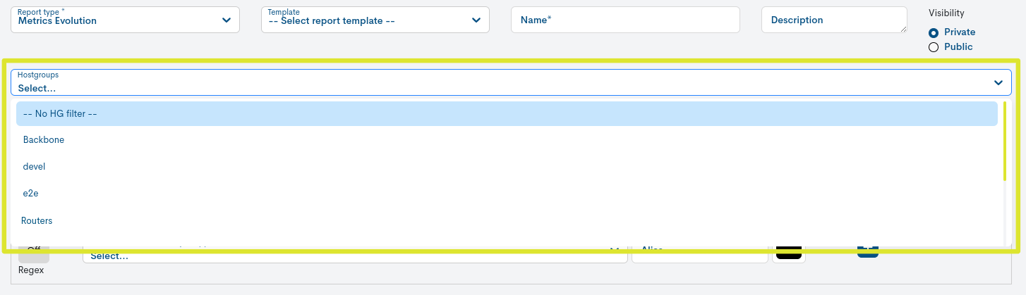
Simply choose the group name from the Host Group dropdown. All groups registered within the realm will be displayed.
To deactivate the filter, the user must choose the No HG filter option, which appears first in the list.
Metrics Configuration
To configure a metric it is necessary to define a set of parameters explained below:
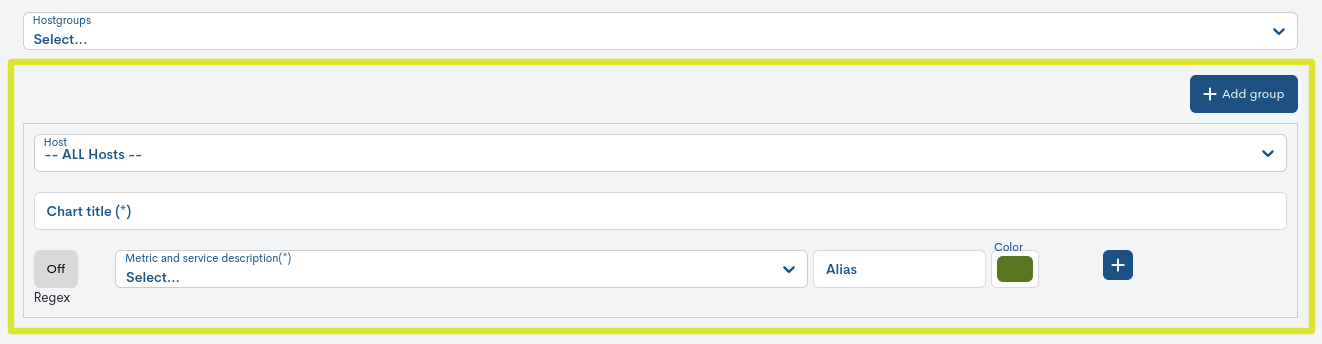
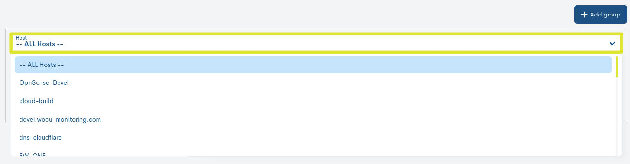
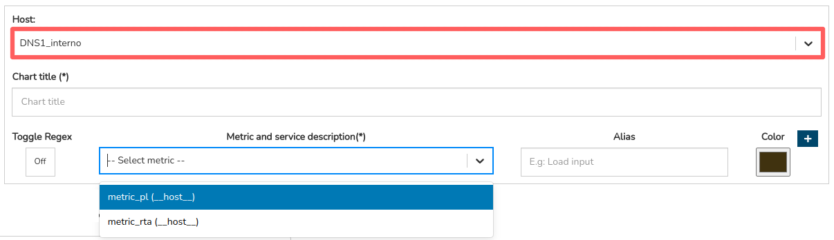
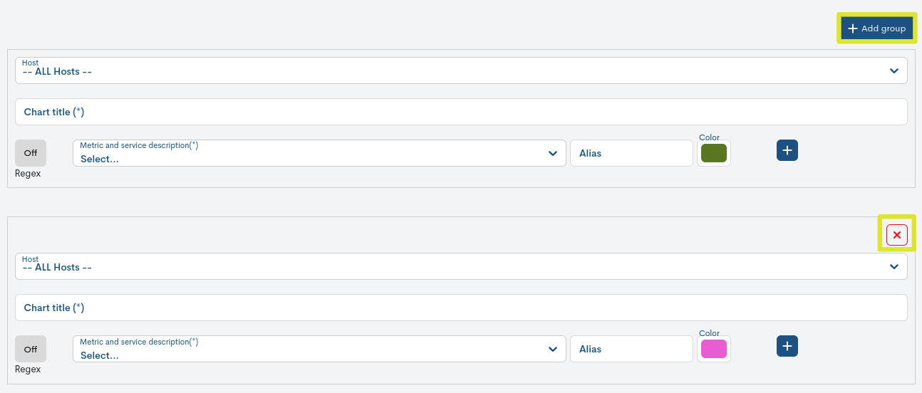
✓ Host Selector (Host)
Drop-down for the selection of a specific Host on which the new report will be based. If you want to generate the report with all the Hosts in the Realm, select the All Hosts option at the top of the list.
Attention
The Device list may be affected by the previous selection of a Host Group. Only the Devices that are part of the selected group will be displayed.
✓ Chart title
Field to add the title of the metrics evolution graph(s) to be displayed in the report.
✓ Filter Metrics and Services using regular expressions (Regex)
By activating this option it is possible to filter Metrics and Services by applying regular expressions. This will be done by using a search pattern, providing greater flexibility and customisation of the filtering.
Ultimately, reports will be generated taking into account only those metrics and/or services whose name/description includes the defined text string.
Enabling this configuration method, will affect the parameter configuration parameter: Metric. As a result of the operability checks that the service launches on the Host to which that it is associated with, a set of metrics are generated that record performance, availability, storage, etc. values.
The following are the two configuration options available: Regex enabled and disabled.
A. Regex Enabled
Two new parameters will be displayed:
Metric: for the filtering of a metric.
Service Description: for filtering a service.
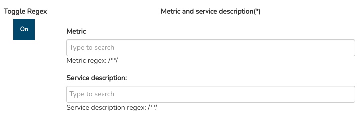
The operation of both fields is very simple, you will have to enter a search pattern that will act as a regular expression. For example, note that when you enter a certain term, such as “traffic”, the system constructs the regular expression
/.*traffic.*/. These wildcards replace any character before or after the entered term.Following the example, with the regular expression
/.*traffic.*/the report will capture all metrics whose name contains the characters “traffic”, i.e. all those metrics related in some way to the incoming and outgoing traffic of the monitored assets. This operation is similar in the Service Description field. In a sense, the use of regular expressions allows generic queries on a specific aspect in a quick and easy way.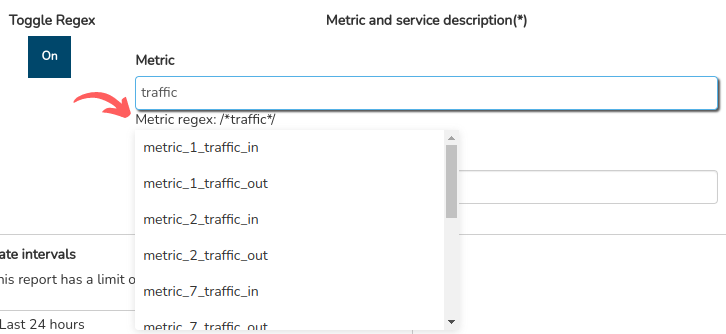
Depending on the chosen Host (Host selector), only the set of metrics generated by the service(s) linked to the Host on which this report will be generated will be displayed.
Attention
As there can be several services associated to a metric and vice versa, the filtering is bidirectional. That is, by capturing one or several services (after defining a regular expression), the metrics filter will be updated showing only the specific metrics associated to the service or group of services and vice versa. In this way, the user can use this relationship to narrow the scope of the report.
B. Regex Disabled
A single selector will be displayed for the search and selection of a specific metric. To do this, type its name in the search bar. When entering characters, WOCU will display a list of metrics whose name corresponds to the characters entered. The search works with the first characters of the name, even with several characters in between or at the end. The user finally has to select one of the proposed metrics from the list. Following the metric name, the service that generates and records the metric is specified in brackets (e.g.: Metric (Service) =
metric_CLOSE (TCP States)).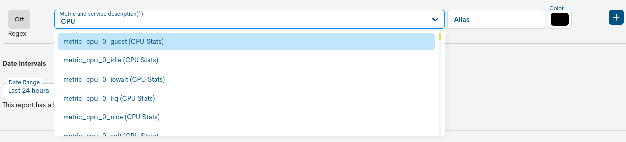
Note
Depending on the chosen Host (Host selector), only the set of metrics generated by the service(s) linked to the Host on which this report will be generated will be displayed. See the following example:
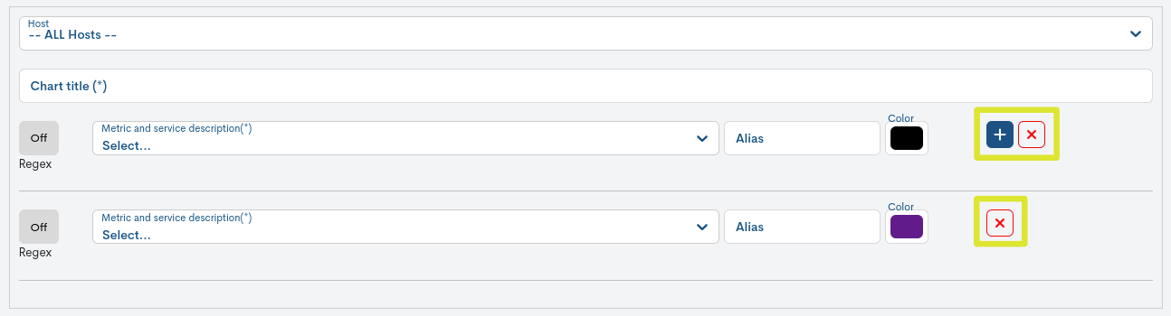
WOCU-Monitoring allows you to set up several metrics and visualise them on a single graph. To the right of the metrics panel there is a button with a plus sign (+). Pressing it will bring up a new row of parameters that will be configured. In case you want to delete one of them, you only have to click on the button with the cross (x) and the set of fields will disappear.
Attention
Given the wide variety of Systems and Hosts that WOCU-Monitoring is able to monitor, a detailed description of the different metrics is beyond the scope of this manual.
✓ Alias
Optional field to add a term identifying the metric, which will appear in the legend of the graph(s) presented in the report.
This option is very useful, as metric names can be complex or imprecise and the use of aliases would make them easier to understand.
✓ Color
WOCU-Monitoring allows you to select the colour of the line of graph values that will appear in the report. As it is possible to add several metrics in a single graph, this option is very practical for analysis, visualisation and comparison.
Attention
The fields highlighted with an asterisk (*), such as: Name, Chart title and Metric are mandatory configuration fields, then their completion is necessary to proceed with the generation of the new report. Otherwise, the system will display the following warning:
✓ Add multiple charts (+ Add group)
It is possible to add several graphs in a single report. At the top of this field there is a button + Add group. Clicking it will bring up a new row of parameters that must be configured. If you want to delete one of them, just click the button with the cross (x) and the set of fields will disappear.
To save the configuration and generate the report, click on the blue button Create.
Once the report has been created and scheduled, you will be taken back to the initial screen of this section, where the reports will be sequentially stacked in the Centralized Report Management.
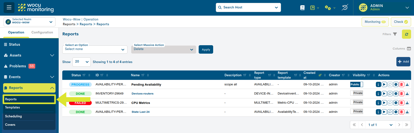
Click on the Name to access the full report. The user is then taken to a new report window where the information generated and collected by the system is presented. These panels are described in detail in the next section.

Setting up a multiple report
WOCU-Monitoring allows the creation of multiple reports in a single operation. This allows the user to define several reports of different types from a single configuration form.
The operation is simple and intuitive. Once the user selects the first report, the system enables the + button in the upper right corner of the configuration form. Clicking this button displays a new form for defining another report.
Attention
The system supports the combination of the seven types of reports available, as long as they are of different types.
If a report is to be deleted, the user can use the x button, which deletes the previously configured settings.
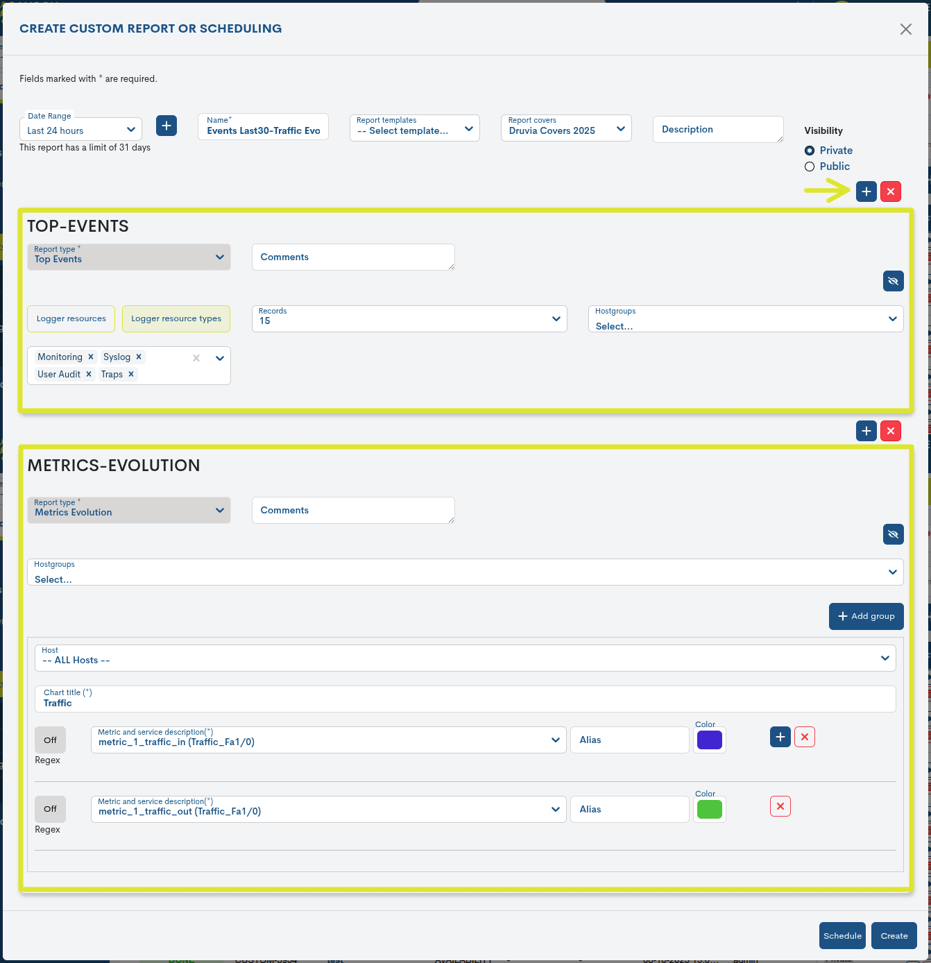
Each configuration form includes a Hide Report Config button (identified by an eye icon with a diagonal line through it), which allows you to hide the corresponding configuration view and expand the available screen space.
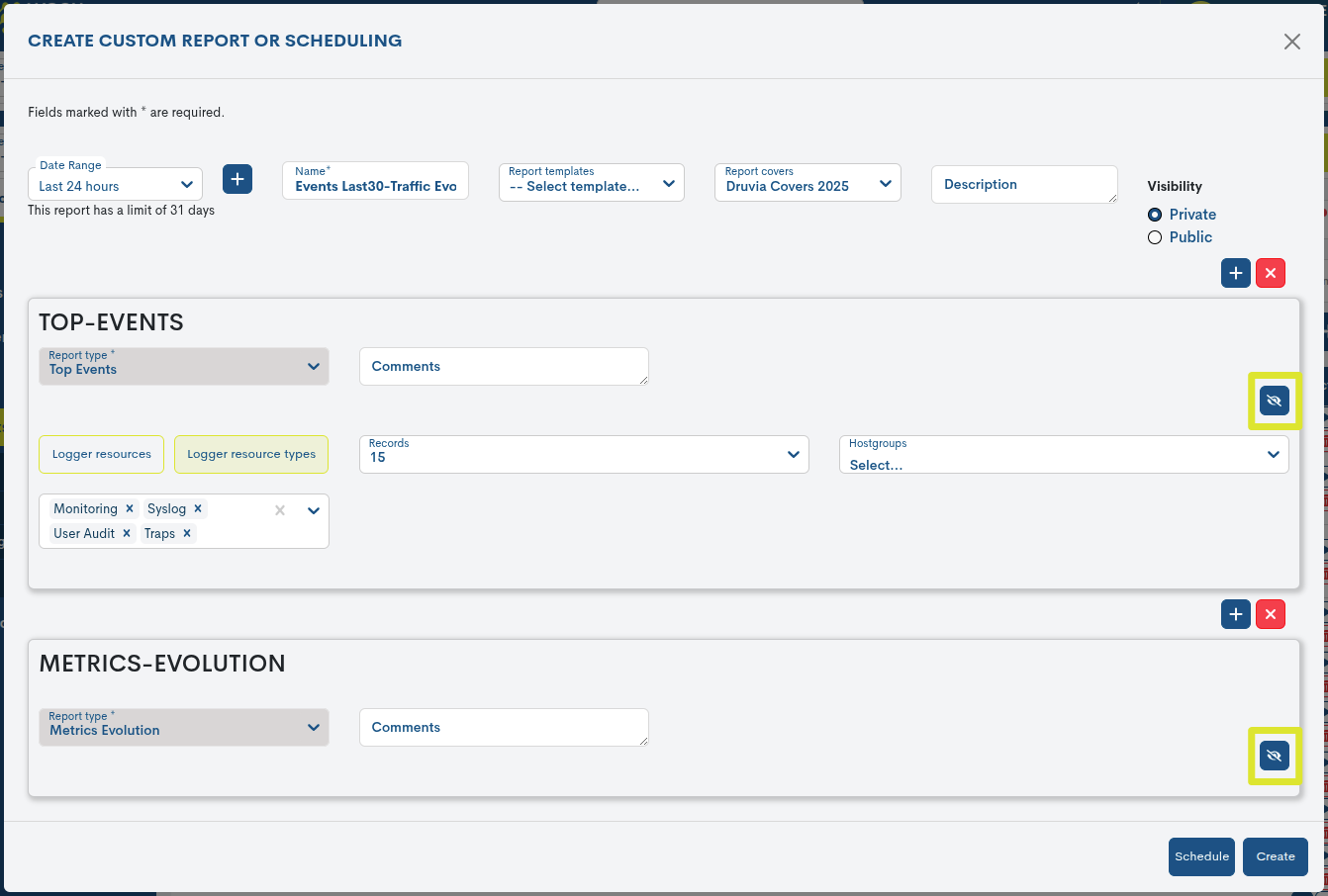
See the following multiple report structured in two separate sections:
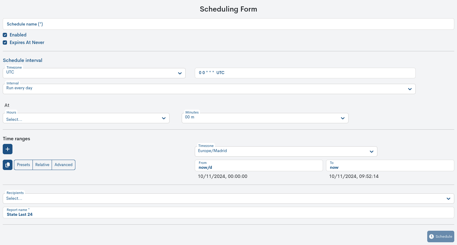
Scheduling of Metrics Evolution Reports
WOCU-Monitoring also allows for the automation of reporting operations, thanks to the ability to schedule their generation and launch at the user’s discretion using the Schedule button.

Next, a form will appear to begin setting up your schedule. **For more information, see the following section: Schedule.
Exporting Metrics Evolution Reports
WOCU-Monitoring also allows the export of the report in PDF, XLSX and JSON formats. These condense all information on the availability of the monitored assets in a document that can be easily dissemination and simple analysis.
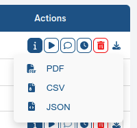
Through the Export selector located in the global report panel, the corresponding files shall be downloaded.
Important
WOCU-Monitoring will return an error message when the report scope exceeds a certain number of devices. The default number is 1,000 devices, but this number may vary depending on the environment and infrastructure being monitored.
Visualization and analysis of Metrics Evolution Reports
Clicking on the name label (column Name) takes you to the full report.
The report’s information is presented through interactive panels and graphs, designed to facilitate user interpretation.
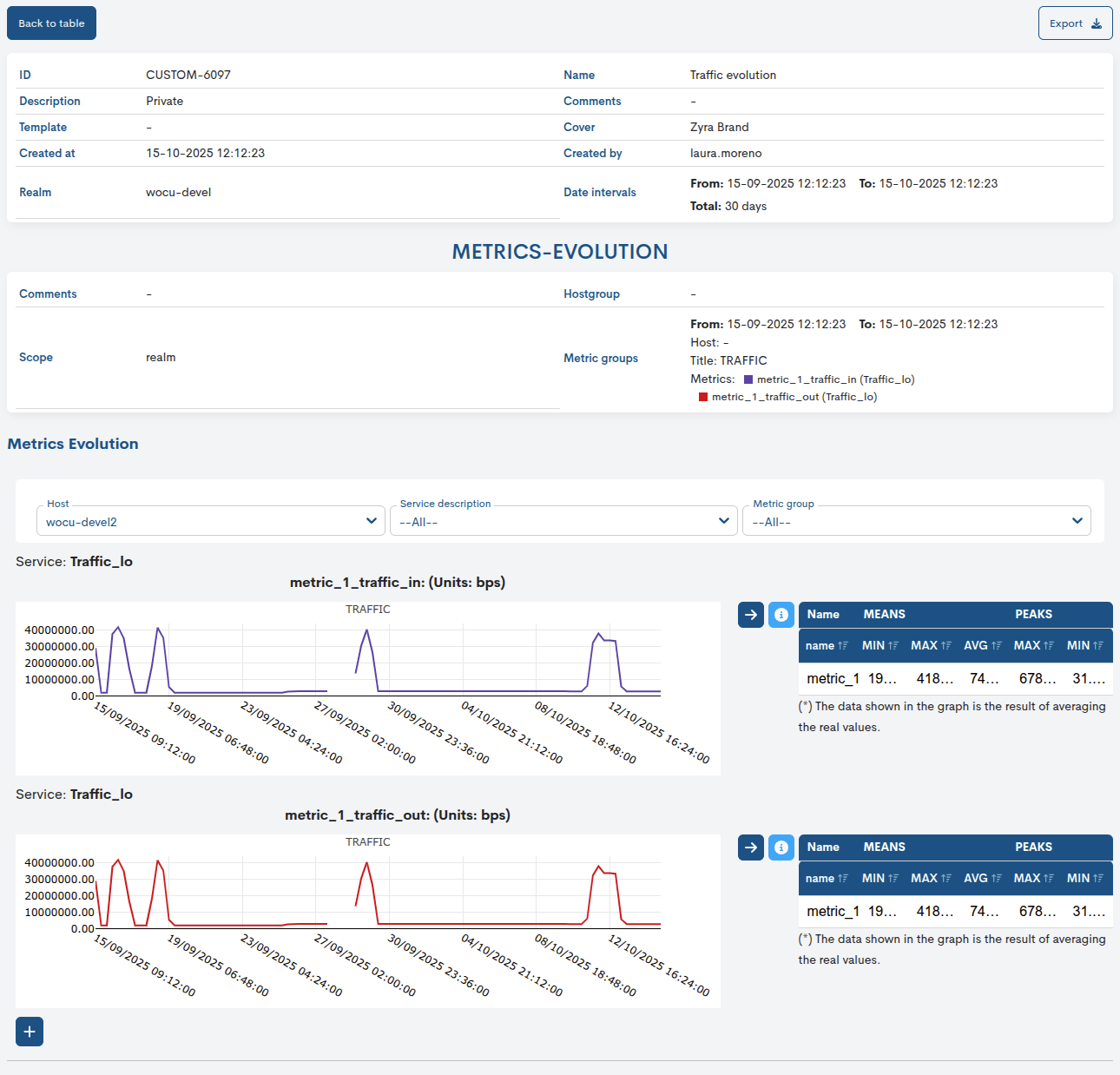
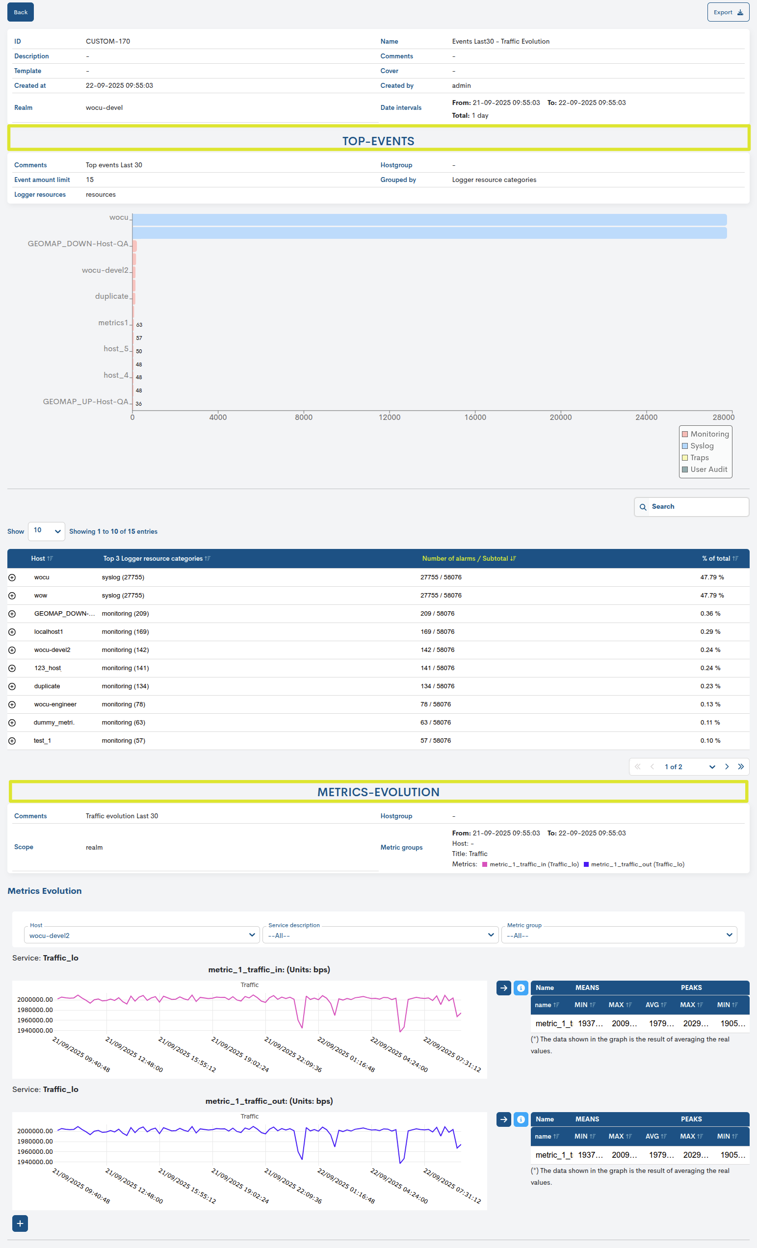
Settings panels
This configuration panel displays the filters and parameters set in the generated report configuration.
These are:
ID: report identifier code.
Description: descriptive text relating to the report.
Template: Templates selected on which the report is based.
Create at: indicates the date and time the report was created.
Realm: indicates the name of the Realm which is the subject of the report.
Name: identification name assigned to the report.
Comments: Free text assigned by the user regarding observations, annotations, or additional clarifications regarding the report.
Cover: Specifies the Covers applied to the report.
Create by: indicates the user who created/owns the report.
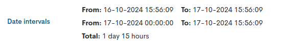
Date interval: Indicates the start and end time and date of the availability data collection period.
In multiple time frames, periods will be presented in a tabular format. The total range limit is 31 days.
Comments: Free text assigned by the user regarding observations, annotations, or additional clarifications regarding the report.
Scope: Indicates the scope of the report.
Hostgroup: Specifies the device group selected for the report calculation.
Metric groups: summarize the analyzed metrics in a tabular format, indicating:
Timeframe: Indicates the start and end time (From:) and date of the period established (To:) in the report.
Host: Device selected for metrics analysis. If an empty space appears, it indicates that a specific device has not been specified.
Title: from the graph of a metric/s.
Metrics*: A set of collected metrics, along with their applied color legend

When the report configuration includes filtering by regular expressions, these will be specified in the Service row.

Metrics Evolution
This panel is presented to the user through two main blocks:
Filtering options
Since there may be a large number of devices and metrics, WOCU-Monitoring has filtering options to refine and organize the data displayed in the graph. These are
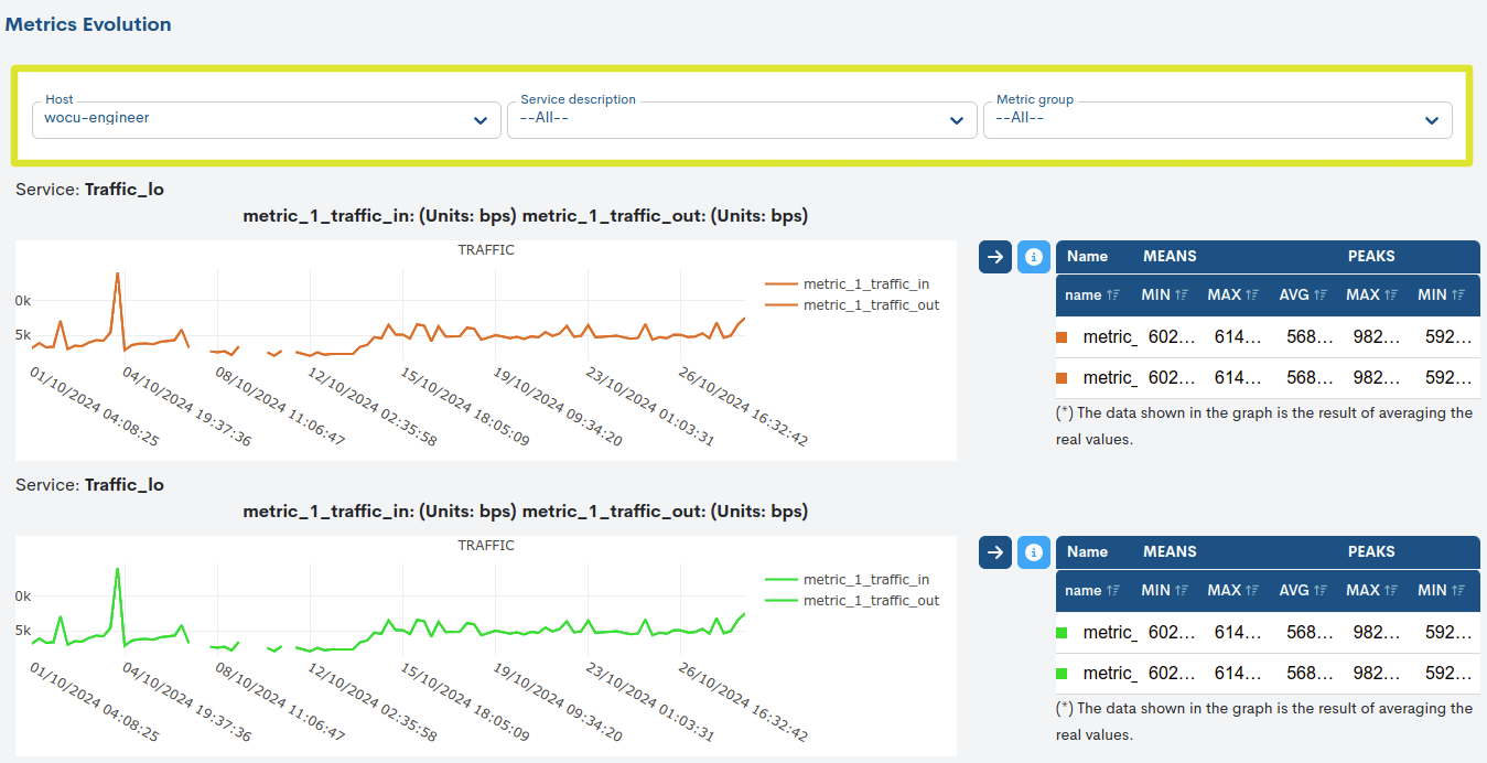
Host
If the report was run with all the Devices in the realm, a list will be displayed so you can freely select one of them and view the evolution of the applied metric.
Service description
This field indicates which Service of a Host the report refers to for the selected metric.
Note
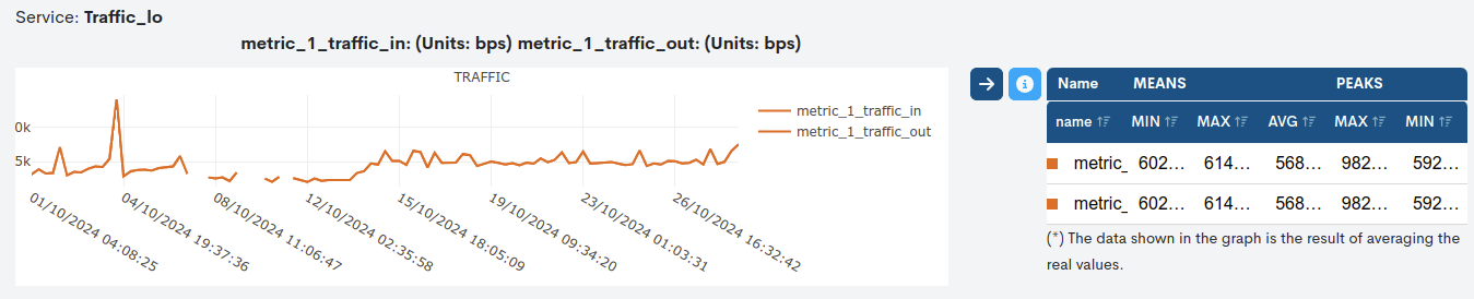
A service can have multiple metrics, for example, the service Traffic_lo has two different metrics: incoming traffic (
metric_1_traffic_in) and outgoing traffic (metric_1_traffic_out), for the device wocu-engineer. Therefore, when this service is selected in this filter, both metrics will be displayed in the graph. This field makes it easier to establish the relationship between the different metrics displayed for the services of a host.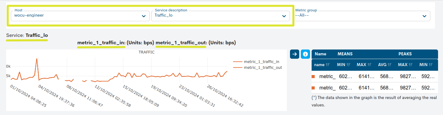
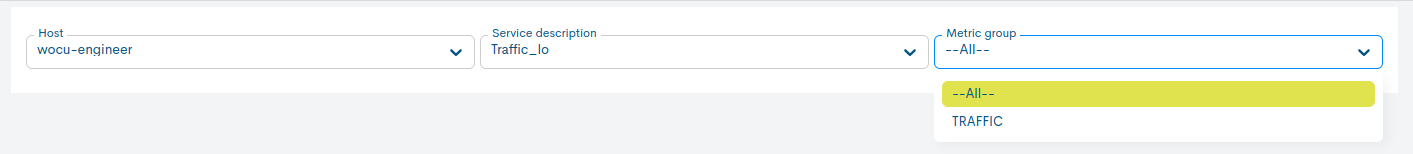
Metric group
If you have generated several graphs, this field will display a list of all of them. You can view the graphs both individually and together by selecting the All option.
Metrics Evolution Graph
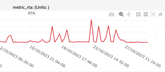
This graph reflects the evolution of a metric/s for a monitored Host over a given time interval.
The graph provides historical information according to the data recorded, which allows to observe its metric evolution over time (values reached on the vertical axis and time on the horizontal axis).
Important
The type of unit of the values obtained from the metrics represented (%, ms, KB/s…), will be indicated on the Y axis of the graph, always and when:
1. The unit is already specified from the source metric storage DB. Otherwise, the magnitude in which the values are modelled and displayed shall not be shown.
2. All metrics collected for the report share the same unit. Otherwise, it will not be displayed.
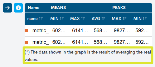
Thanks to the legend on the right of the graph, we can identify the colour of the line representing the values collected for a given metric, as well as the maximum (MAX), average (AVG) and minimum (MIN) values recorded. As it is possible to add several metrics in a single graph, the legend makes it easier to visualise and compare them.
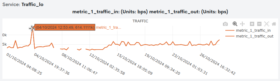
The maximum and minimum values are also visible on the graph. By placing the cursor over the highlighted circles at a particular point in the function, a pop-up window with additional information will appear. WOCU will first indicate the type of value (maximum or minimum) and the metric it belongs to, then the date and time it was recorded, and finally the exact value reached (in the unit recorded in the database).
Attention
To reduce the computational burden of the report, the data shown in the graph is the result of averaging the actual values recorded. This situation is notified to the operator with the following message:
In addition, the legend can be hidden to leave more space for viewing the graph. To do this, simply click on the icon with the arrow to the right (“→”), located to the left of the legend.
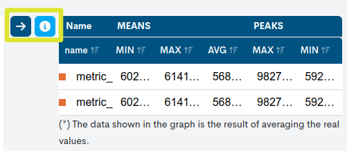
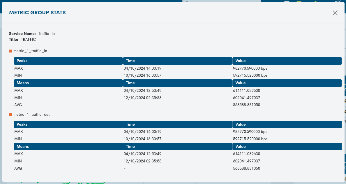
By clicking the i button, a new Metric group stats summary box is displayed that makes it easy to view highlighted data about a selected metric and device.
This information consists of:
Service Name
Title
Global table with relevant values achieved in the evolution of the metrics (MAX, MIN and AVG).
Finally, the graph incorporates a set of functionalities that make it easier to understand and analyse. These are:
Download plot: a download of the plot in
svg.Pan: with this option it is possible to scroll or move the graph along its axes.
Autoscale: this option will automatically scale axes so that all data points are visible on the graph, preventing any point from being outside the visible range.
Zoom in: the option of the magnifying glass icon with the “+” sign, zooms in on the displayed graph.
Zoom out: the magnifying glass icon option with the “-” sign zooms out the view of the displayed graph.
Rearrage: the option of the icon with horizontal lines, returns to the default zoom view.
Reset axes: this option automatically resets the limits of the axes to their default values, undoing any manual adjustments previously made.
Comments
Free text field to add comments, notes, or additional clarifications about the report.