Netflow
The Netflow module in WOCU-Monitoring allows you to view and analyse network traffic using flow records generated by network devices. The flows contain aggregated information on communications between devices, including:
Source/destination IP address
Ports used
Protocol
Traffic volume
Connection duration
The Netflow module offers the following features:
Network usage analysis
Identifying the hosts with the highest traffic usage
Detection of anomalous behaviour patterns
Research into inter-system communications
Visualisation of the geographical origin of traffic
Attention
This makes it possible to analyse network behaviour without having to capture entire packets.
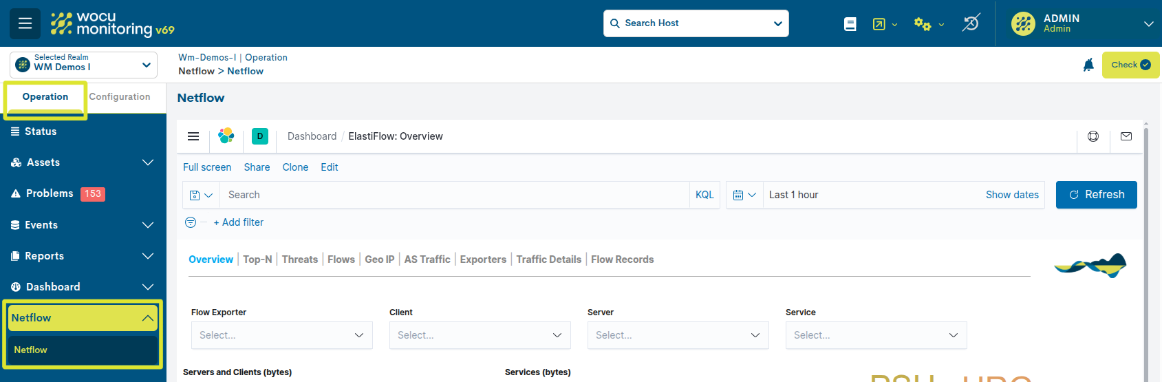
Access to Netflow
The Netflow module is available via the WOCU-Monitoring interface. Go to the menu: Operation > Netflow. This will display the Kibana-based traffic dashboard, which is natively integrated into the WOCU-Monitoring interface.
Note
Access to the Netflow module depends on the user type and the permissions assigned. To request or change access rights, please contact your system administrator.
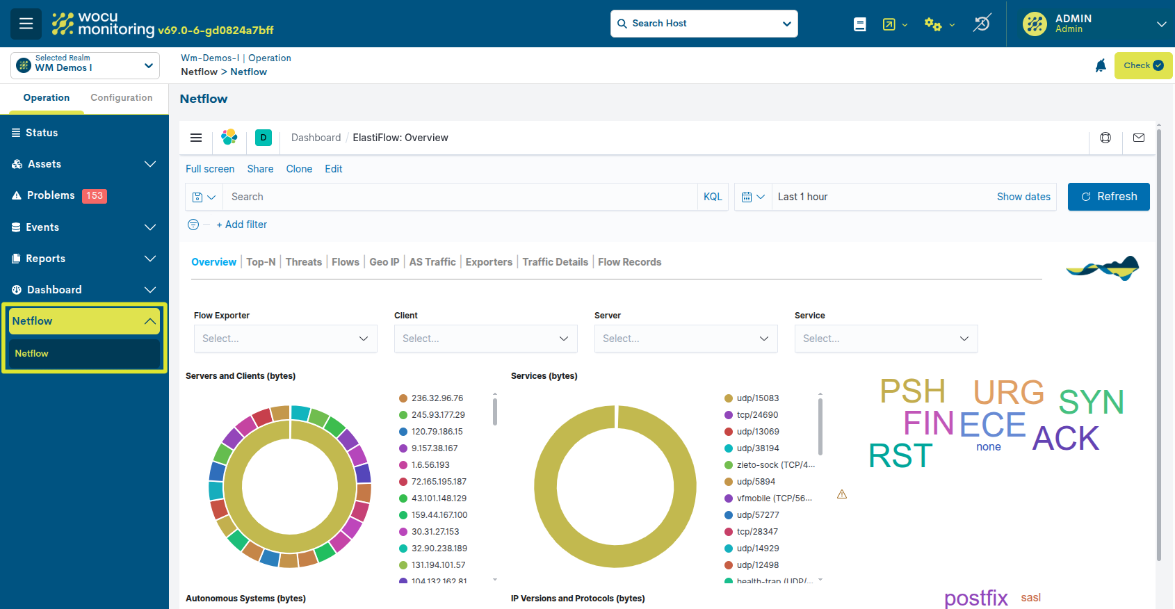
Navigating the Netflow panel
The Netflow dashboard consists of various views that allow you to analyse traffic from different perspectives.
Each view contains interactive charts that allow you to apply filters and explore the data.
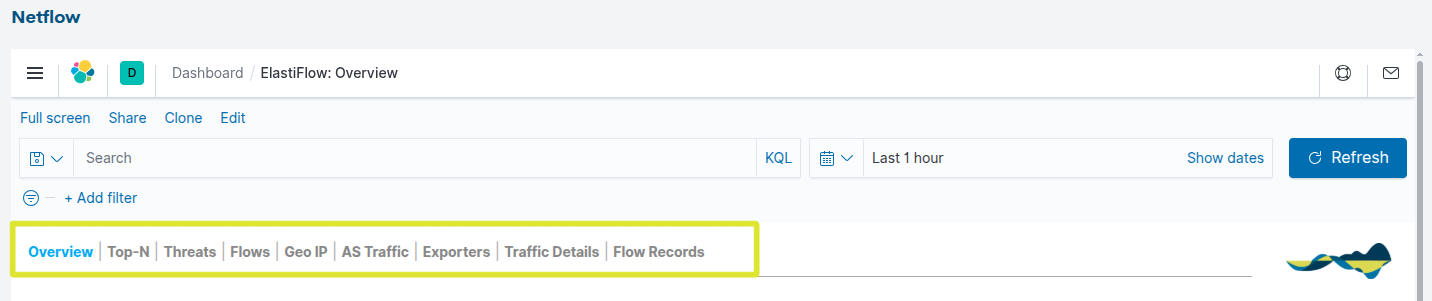
The available views are:
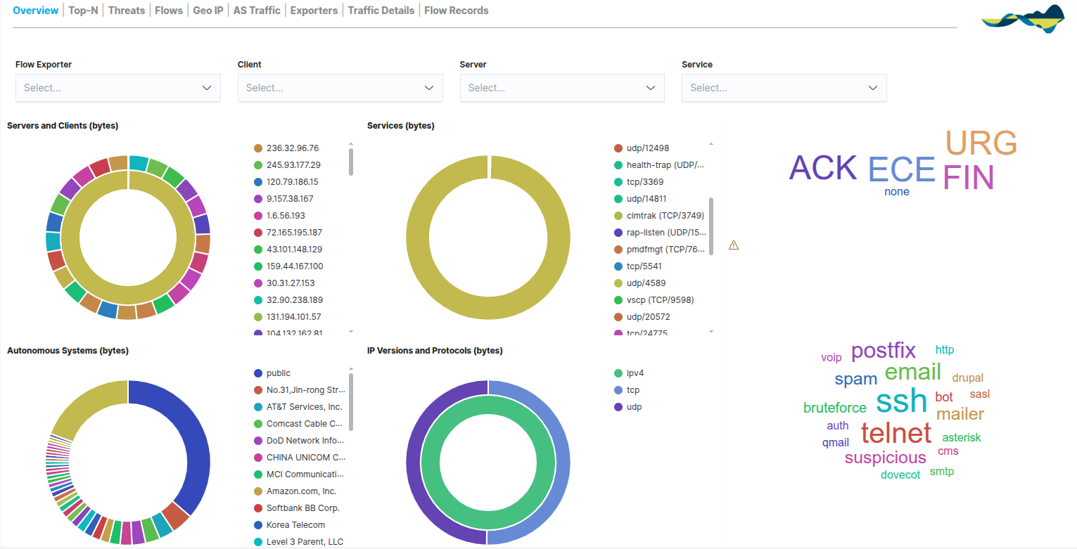
Overview
The Overview panel provides an overview of network traffic using visual representations such as pie charts and word clouds. This view allows you to quickly gain an overview of network traffic behaviour.
From the Overview panel, you can view:
Total traffic volume
Distribution of protocols
Main source and destination IP addresses
Traffic volume by port
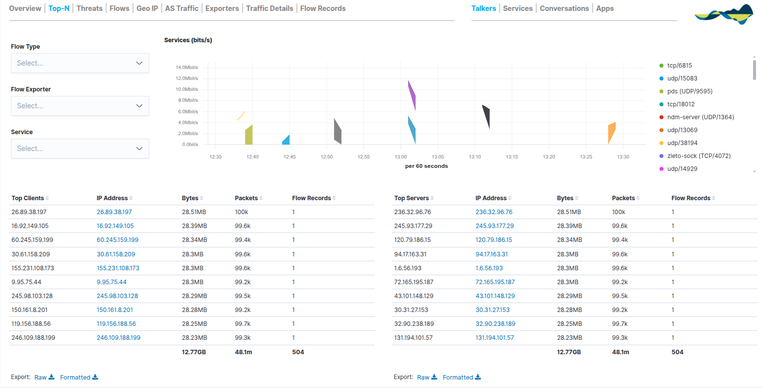
Top-N
The Top-N dashboard is designed to prioritise the network elements generating the highest volume of traffic. Its main function is to provide clear visibility into the primary resource consumers, making it easier to identify:
Hosts with the highest traffic
Most frequently used ports
Most common protocols
More active networks
The system organises the information into comparative tables that allow network participants to be ranked according to three key metrics: bytes, packets and flow records.
In addition, the Services (bits/s) chart complements the tables by showing how traffic has changed over time.
This dashboard is therefore particularly useful for identifying servers with high bandwidth usage, applications generating high traffic, and anomalous network behaviour.
Additional sub-views are available in the top-right corner:
Talkers: Focus on the most active hosts.
Services: Detailed analysis of ports and protocols.
Conversations: Two-way relationships between source and destination.
Apps: Identification of specific applications based on traffic analysis.
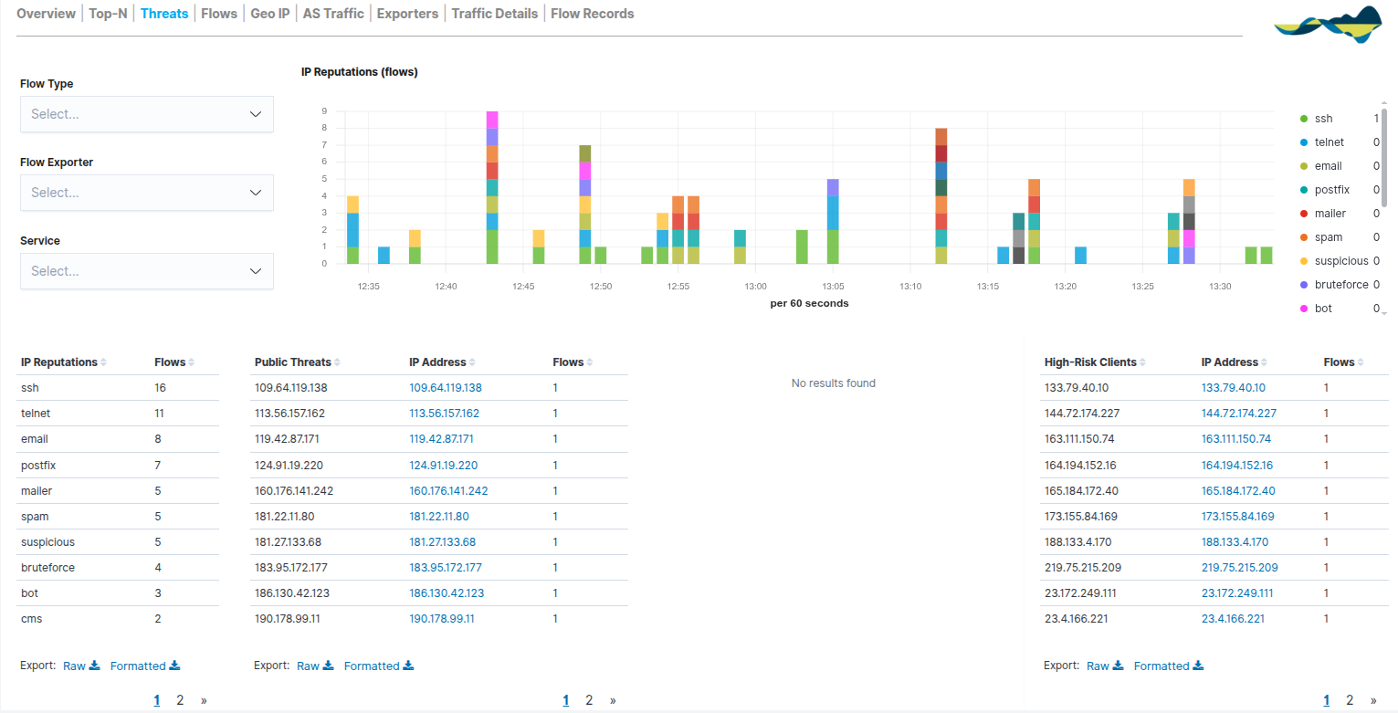
Threads
The Threads panel provides a critical layer of security by cross-referencing network traffic in real time against reputation lists and threat intelligence. Its aim is to identify suspicious IP addresses and potentially malicious activity traversing the network; in other words, it identifies suspicious traffic within the monitored network.
These addresses may be related to:
Bots
Spam
Worms
Automatic scanners
The report is organised into two areas of analysis:
IP Reputations (Time Series): a stacked bar chart showing the evolution of threats over time. Each colour represents a type of risk (e.g. SSH, Telnet, spam), enabling the detection of spikes in attacks or intrusion attempts at specific times.
Threat Intelligence Tables:
IP Reputations: classifies traffic volume according to risk label.
Public Threats: lists external public IP addresses that have been identified as dangerous.
High-Risk Clients: identifies internal hosts or clients that are interacting with high-risk destinations, which is vital for detecting potentially compromised local devices.
Flows
The Flows tab provides an advanced visual representation of the interactions between the various network assets (clients, servers, internal and external hosts); in other words, it shows the communications between systems.
Unlike static tables, this view uses a central flow graph to show how traffic flows from senders to receivers, providing an understanding of the logical topology of communications. This view therefore allows you to analyse:
Communication patterns
Traffic between networks
External connections.
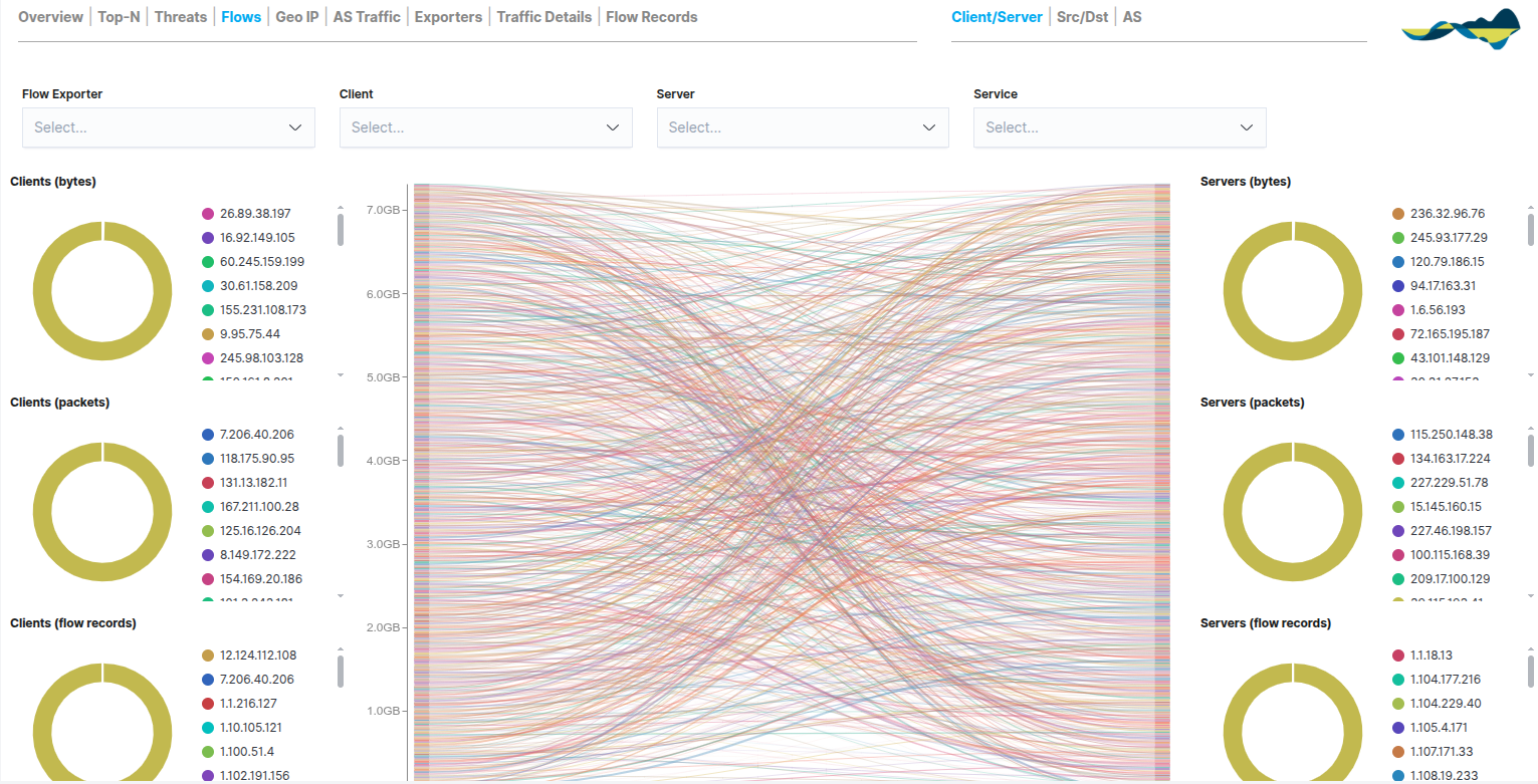
The view is organised into three main columns that compare metrics for Clients (left) and Servers (right):
Bytes: a comparison of the volume of data transferred.
Packets: number of packets sent/received; useful for diagnosing network performance.
Flow Records: number of open sessions, ideal for detecting persistence in communications.
In the top-right corner, users can switch between views using the navigation sub-views:
Client/Server: standard view geared towards end-users.
Src/Dst (Source/Destination): technical analysis based purely on source and destination IP addresses.
AS (Autonomous Systems): visualisation of traffic between autonomous systems for the analysis of Internet routes.
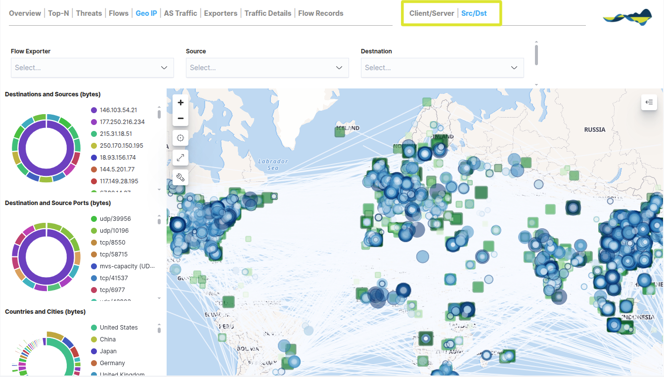
Geo IP
The Geo IP dashboard adds a geographical dimension to traffic analysis by plotting public IP addresses on a world map. This view is essential for understanding the global distribution of network communications and for monitoring perimeter security.
The information is presented via an interactive map that allows users to view the following dynamically:
Source and destination countries: Clear identification of where incoming traffic originates from and where outgoing traffic is headed.
Traffic volume by region: Data flows are represented using connection lines and density maps that indicate the geographical areas with the highest data exchange.
Route traceability: Visualisation of communication paths between internal nodes and globally distributed servers.
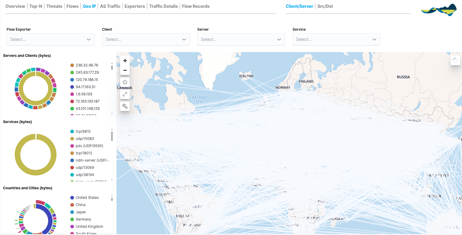
To complement the map, the panel includes quick-reference metrics on the left:
Servers and Clients (bytes): a ranking of the most active local or remote hosts within the selected geographical area.
Services (bytes): a breakdown of which services (ports and protocols) are being used in international communications.
Countries and Cities (bytes): a comparative chart that quantifies traffic by specific regions, making it easier to identify the countries that account for the largest share of bandwidth.
In the top right-hand corner, users can change the map view using the navigation sub-views:
Client/Server: displays the geolocation based on the role of the IP address (who is requesting the information and who is providing it).
Src/Dst: Technical analysis focused strictly on the physical source and destination of the packets.
AS Traffic
The AS Traffic dashboard provides an overview of network traffic, grouping communications according to the Autonomous System (AS) to which they belong. This view is essential for understanding how the local network interacts with the major infrastructures and service providers that make up the Internet.
This view enables network administrators to analyse the source and destination of traffic at the provider level, identifying:
Network providers involved in communications
External networks with the highest traffic volume
Source of external traffic.
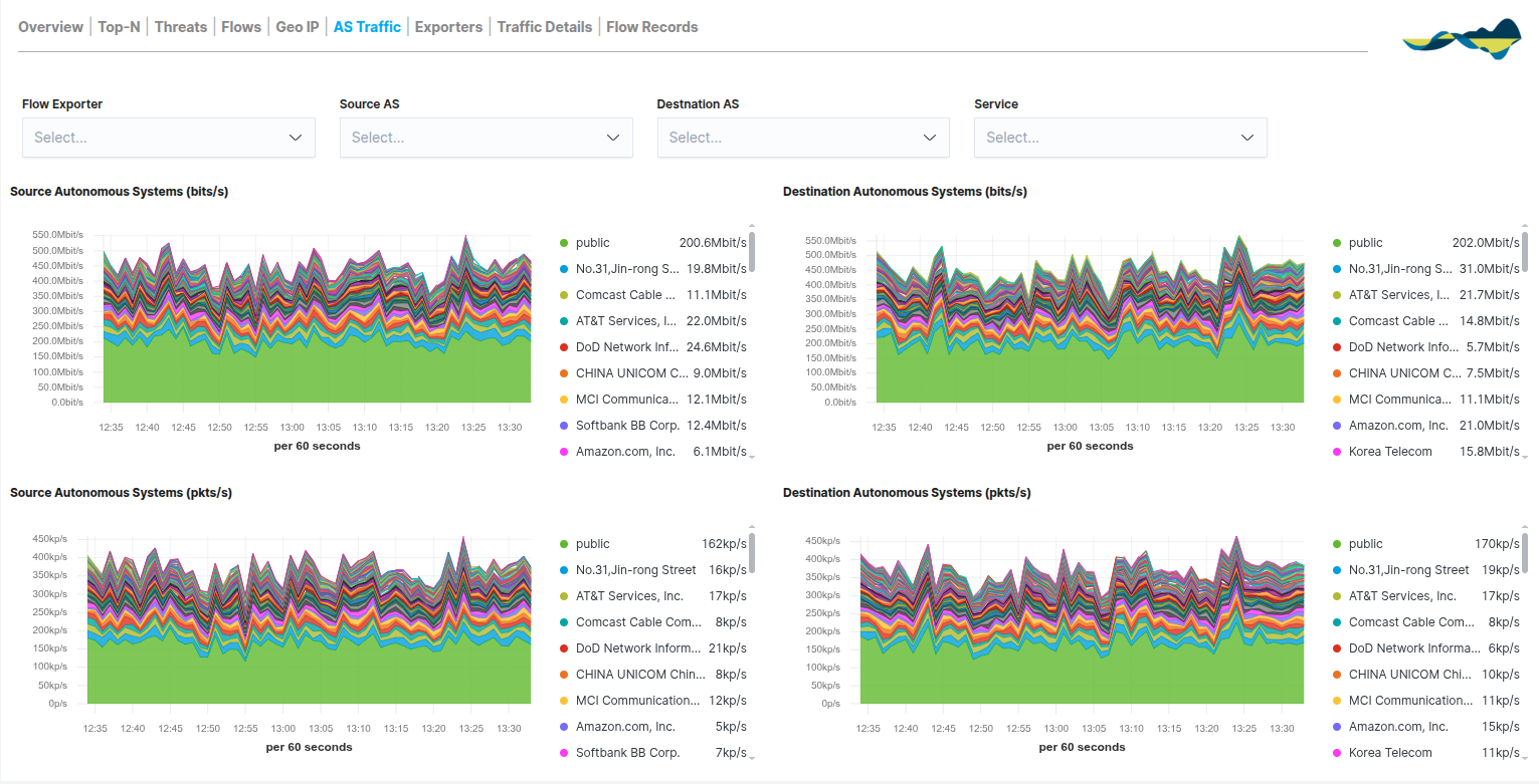
The dashboard is organised into stacked area charts that compare traffic from the Source with that from the Destination, using two key metrics:
Traffic in bits/s (Bandwidth): shows the volume of data per second. It is the key metric for analysing internet link usage and detecting congestion caused by specific providers.
Traffic in pkts/s (packets per second): records packet density. An unusually high packet volume relative to bits/s may be an early indicator of network attacks or scans originating from a specific AS.
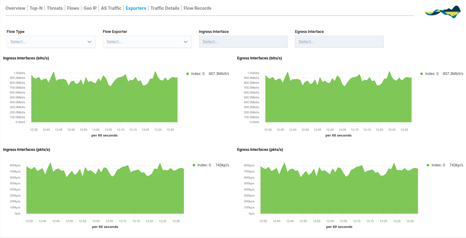
Exporters
The Exporters panel shifts the focus of the analysis from end hosts to the network infrastructure itself. This view categorises traffic according to the network device (router, switch, firewall) that generates and sends the data streams, enabling the performance of data collection points to be monitored.
This view is essential for monitoring the health of your metrics collection, enabling you to analyse:
Traffic by network device
Distribution of cargo among exporters
Behaviour of network segments
Unlike other panels, this tab breaks down activity by the direction of traffic on the device’s physical or logical interfaces:
Ingress Interfaces (bits/s and pkts/s): displays the incoming traffic captured by the exporter. This is key to measuring the load a node receives from its local network segment.
Egress Interfaces (bits/s and pkts/s): displays the processed outbound traffic. This allows you to verify how the device routes data to other destinations.
Both metrics are presented in terms of both bandwidth (bits per second) and packet density (packets per second), making it easier to identify bottlenecks or congestion on specific interfaces.
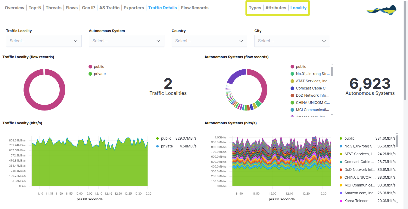
Traffic Details
The Traffic Details panel allows you to delve deeper into the technical aspects of the recorded communications. Unlike other views, this tab breaks down the traffic using specific metrics that help you understand not only how much data is being transmitted, but also how and from where.
The dashboard organises the information into comparative columns (Clients vs. Servers) and includes:
Host Counter: a numerical display of the total number of unique clients and servers detected.
Flow Records: doughnut charts showing the distribution of sessions by host.
Time Series (bits/s and pkts/s): line charts that allow you to compare the bandwidth usage and packet load of the most active hosts over time.
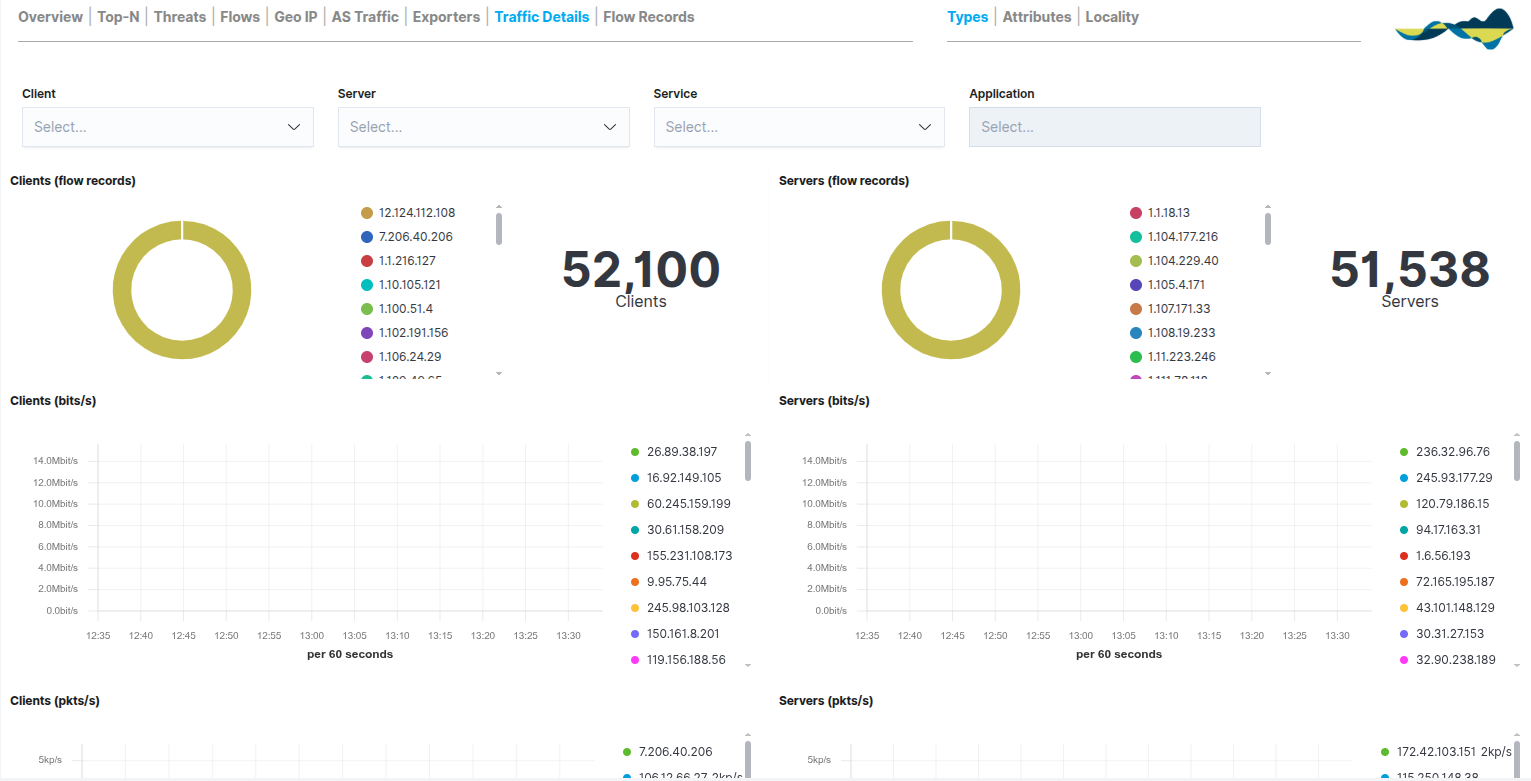
In the top right-hand corner, three analysis views are available:
Types: classification by traffic type and protocols.
Attributes: analysis of the technical attributes of the packages (such as sizes or flags).
Locality: information on the location of the traffic (distinguishing between public and private networks and Autonomous Systems).
Flow Records
The Flow Records panel serves as the module’s raw data repository. Whilst the previous tabs provide aggregated views and statistics, this view displays a complete and detailed list of every individual communication recorded by the probes.
Each record includes information such as:
Source/destination IP
Port of origin/destination
Protocol
Traffic volume
Duration of the call
The panel is divided into three key sections to facilitate analysis:
Volume Metrics: a total counter for Flow Records alongside a time-based bar chart showing the density of records processed per 60-second interval. This allows you to identify peaks in transaction activity.
Events Table: a paginated and sortable list that allows you to browse through thousands of records. Expanding each row reveals the full JSON details of the flow.
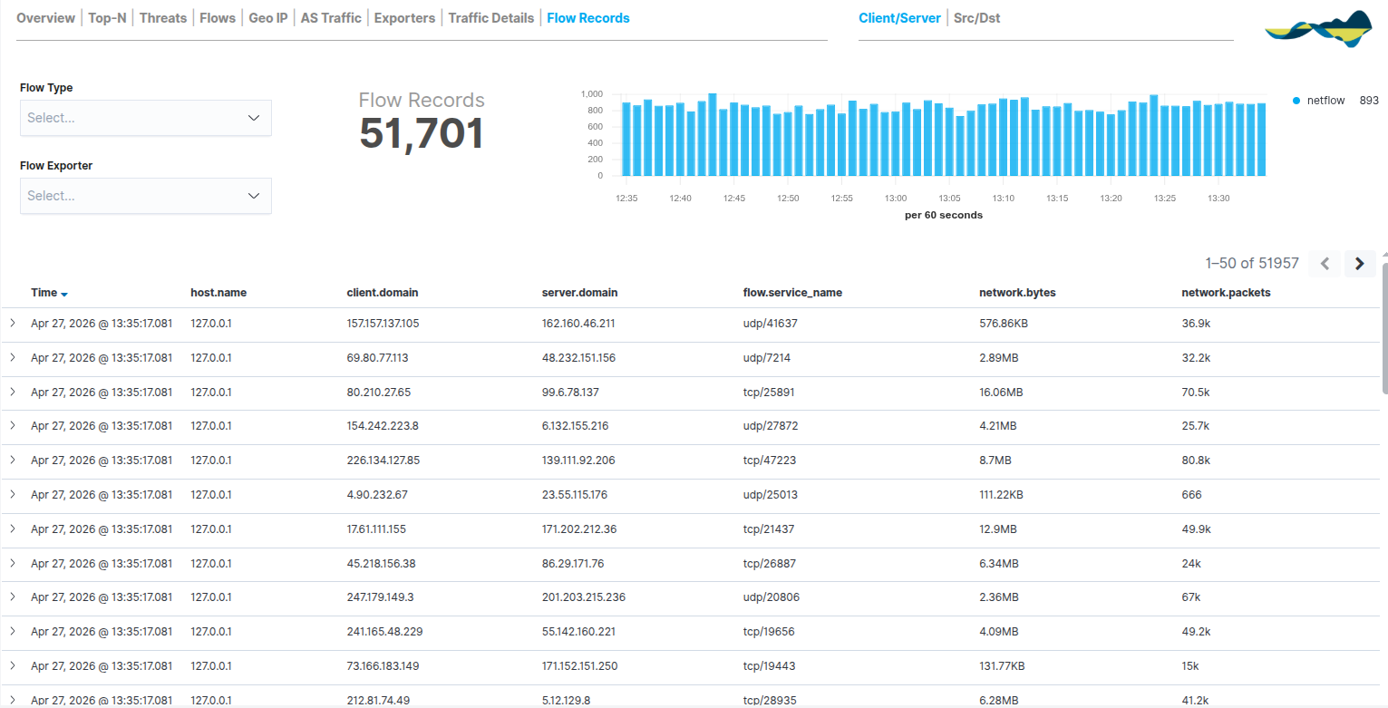
In the top-right corner, the user can switch between the Client/Server and Src/Dst views to reorder the column hierarchy as required for the analysis.
Use of filters
The panels allow you to apply filters to refine the results displayed. The available filters include:
Source/destination IP address
Port
Protocol
Country
Autonomous System
Export probe
Time interval
Filter Bar and Advanced Search
The following filter options are located at the top of the module:
Filter and Search bar: allows you to run queries using KQL (Kibana Query Language).
Time Range: allows you to define the time window for the data being analysed. You can choose from quick options (Last 1 hour, Last 24 hours, etc.) or set specific time ranges by selecting particular dates and times on the calendar.
Operating Principles
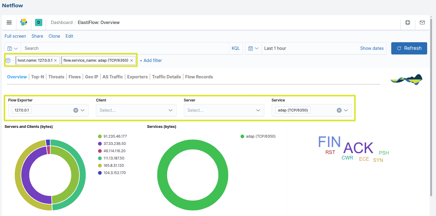
The filters can be combined, which means you can apply several at once to perform more accurate analyses (for example: traffic from a client to a server on a specific service).
When you apply a filter, all the charts in the panel are automatically updated to show only the data that meets the selected criteria, allowing you to move from an overview to a much more detailed analysis in just a few steps.
See the following example in the Overview view, which analyses only the behaviour of the TCP/6350 service reported by the host 127.0.0.1, allowing this traffic to be isolated from the rest of the network for targeted analysis.
Best practice
To ensure proactive network management and maximise the benefits of the Netflow module, we recommend incorporating the following procedures into your workflow:
Regular review of the Overview dashboard: check the overview daily to familiarise yourself with your network’s performance, making it easier to spot any anomalies straight away
Monitor changes in traffic: as a sudden shift in the traffic mix (for example, a sudden increase in UDP compared to TCP) may indicate application failures or attempts to overload the network.
Analysing traffic to unusual destinations and eliminating unnecessary traffic flows.
Resource monitoring and optimisation: by regularly identifying users or servers that consume the most bandwidth, in order to assess whether it is necessary to redistribute the load across different exporters.