Detail view of Services and Business Processes
The Service Detail View linked to a Hosts allows the user to directly access complete and up-to-date information about the selected service. All this information is collected during the last 24 hours and is displayed between the KPI`s sticky and the following sections:
BP Trace (only in services belonging to a Business Process)
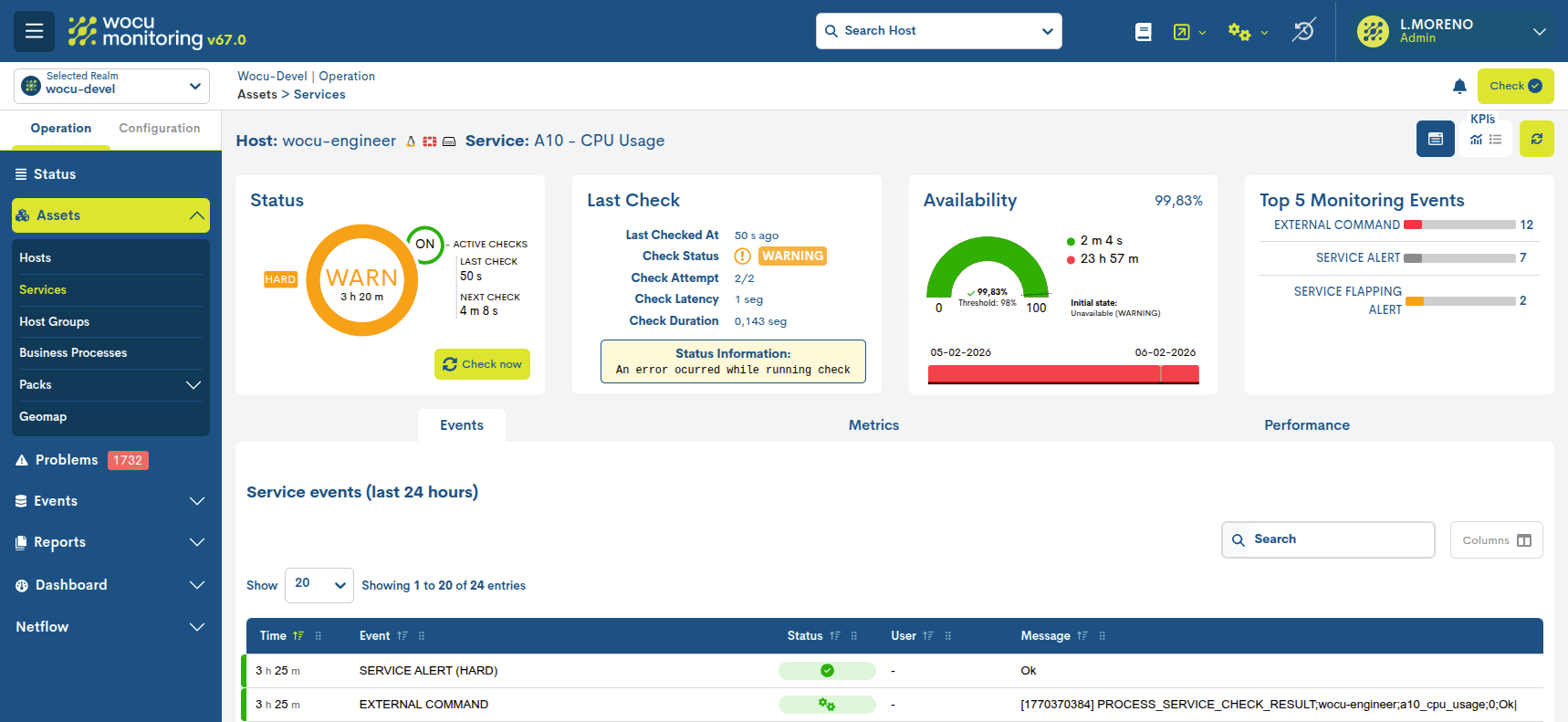
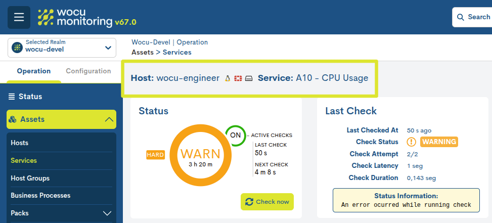
In the top bar, next to the name of the host, the service in question is specified. After the name of each host and service, the system sets the icon identifying the Monitoring Pack to which it belongs.
Actions regarding the service
From this view, it is possible to execute actions directly on a specific monitoring service without needing to access the general inventory. This functionality allows for quick and contextual operations, facilitating the daily management of the selected service. Furthermore, the availability of these actions is conditioned by the current state of the service associated with the device, ensuring that only the permitted operations are displayed and executed according to the given circumstances
Note
These actions are the same as those present in Assets > Inventory of Services, ensuring functional consistency across the entire platform.

Pressing the button displays a selector showing all the actions that can be performed on that specific service.

These are:
Important
Once the desired action has been selected, it is necessary to refresh the viewso that the system initiates the corresponding process and the associated changes associated with the executed action.
To facilitate operational monitoring, icons representing each action are displayed in the service’s KPI: service-status-SLA.These icons allow for quick identification of which actions are enabled or active at any given time, providing a clear view of the service’s operational status.
KPI`s
This space displays a series of dashboards with key performance indicators and operational statuses for the service in question. The data is displayed across four dashboards and collected over the past 24 hours.

KPIs can be viewed in two possible ways:
Full view
By activating the icon marked in the following image, the following KPIs are displayed, with detailed data and interactive graphs:

Status
This first panel indicates the operating status of the host and the monitoring checks performed on it. In addition, other complementary data is provided as explained below.
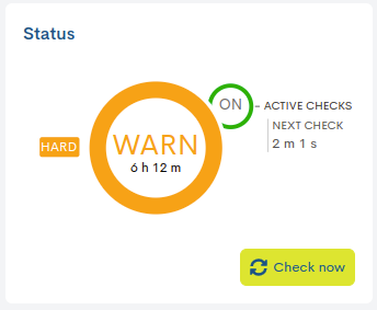
✓ Current service monitoring status and uptime
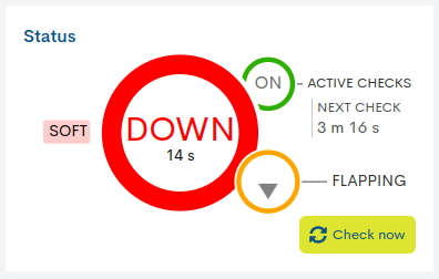
Inside the central circle is indicated: the state that the service records and the total time that the current state has been active. In the previous image, the service has been in WARNING state for six hours and twelve minutes.
The rapid alternation of state changes in a service is known as flapping*. In the panel it is also represented by a yellow half circle with a blinking gray arrow inside it.
- ✓ Monitoring Check: Active Checks/ Next Check
WOCU-Monitoring performs checks to assess the operational status of the service.
The smaller circle ON/OFF, located next to the label Active Checks, indicates whether the check option is activated or deactivated. Additionally, the label Next Check shows the time remaining for the next check. In the image above this function is enabled and the next check will be performed in two minutes and one second (“Next check: 2 m 1 s”).
The option to disable service monitoring checks is accessible from the Disable active checks for services action within Actions on inventoried services (ℹ).
Soft and Hard States
Related to the checking task, this panel also offers additional information about the types of statuses obtained and their severity level, using the following labels:
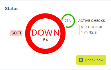
Soft: is assigned when the status of the host obtained is not definitive, since it may or may not be reversed in the next check attempt. If the predefined number of attempts is exceeded, obtaining negative statuses, the error severity level will be raised to HARD type. The objective is to avoid false alarms due to transient problems.
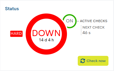
Hard: is assigned when the status of the host obtained is continuously erroneous, without being corrected. That is, when the host returns a negative status in the first attempt and also in subsequent checks, exceeding the predefined number of attempts. This new situation is then notified to the contact user.
✓ Icons of actions applied to the service
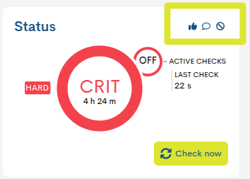
When a service has actions enabled or running, the widget will display icons representing each action. These icons allow you to quickly identify which actions are active at any given time, providing an immediate and clear view of the service’s operational status.
The possible actions are explained in the following section: Actions regarding the service.
Last check information
This panel provides information related to the last check performed on the service in question. The data offered are:
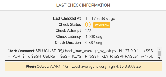
✓ Last checked at: indicates how long ago the last check of the service was performed.
✓ Check status: indicates the status resulting from the executed check.
✓ Check attempt: indicates the number of attempts that must be made (obtaining an erroneous result) for the service to pass from SOFT to HARD error level. For example, in the previous image, it is defined that after two failed checks, the error severity level is raised from SOFT to HARD.
✓ Check latency: is the difference between the scheduled check time and the actual execution time, i.e. it indicates the check delay time.
✓ Check duration: time taken by the server to give a check response.
✓ Check Command: specifies the complete check command that has been executed to determine the status of the Service. Due to the sensitive data that it may display, this information will only be visible after enabling the Show full check command option in the User preferences.
✓ Status Information: output message obtained with information relating to the current status of the Service. The nature of the messages will vary depending on the type of asset and its configuration.
Availability
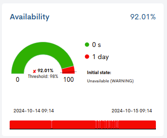
This panel has two graphical elements that provide information related to the level of availability of the service in question.
Pie chart
It represents the percentage of service availability reached in the last 24 hours. The percentage value is indicated inside the graph, together with the minimum availability threshold established (Threshold) by the user, marked on the graph with a dashed line.
Depending on whether this threshold is met or not, a green “✓” will appear in front of the availability percentage when the availability exceeds the set value, or a red “X” will appear otherwise.
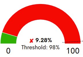
In this example, the availability percentage obtained (9.28%) is below the established threshold (98%).
Time bar
This time bar provides a history of the availability of the service over the last 24 hours, showing the exact moment or period of time when it was not operational.
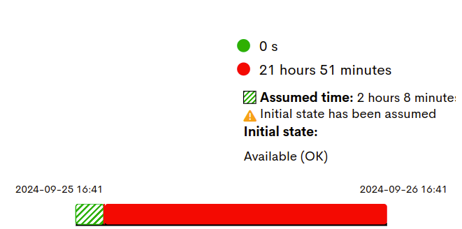
The complementary legend informs about the period of time (in days, hours and seconds) of availability (green colour) and non-availability (red colour) of the service.
There is also the possibility that the system has not collected enough data to determine the initial status of a service. In this case, the user will be able to assume and assign a starting status. This new situation is also recorded and displayed in the time bar and in the legend:
Initial State: indicates the state defined by the user, for the time period that will be assumed. This value is configured in the User preferences, specifically in the filter Status Initial SLA Host.
Assumed time: indicates the total duration of the assumed event and is represented in the bar with a striped pattern. The user can configure the initial state of the service in the User preferences, specifically in the Status Initial SLA Service filter.
Top Monitoring Events
This panel reports, through a maximum of five bars, the most frequent types of Events in the last 24 hours, for the service in question.
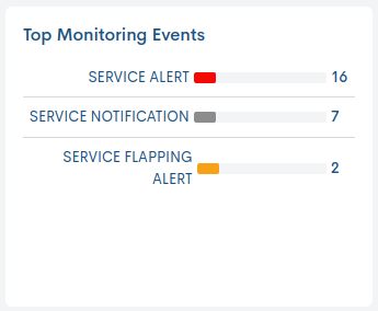
The legend indicates the type of event to which each bar refers, and each bar indicates the number of times an event has occurred. Placing the cursor over a bar displays a pop-up message with the type of event, plus its total value of occurrences.
The different types of Events are explained in detail in the Event field, in the Monitoring Event List Fields section.
Summary view
By activating the icon marked in the following image, the previous KPIs are displayed, but in a more compact format for quick reading:

It’s also possible to hide the panel block by toggling both buttons.
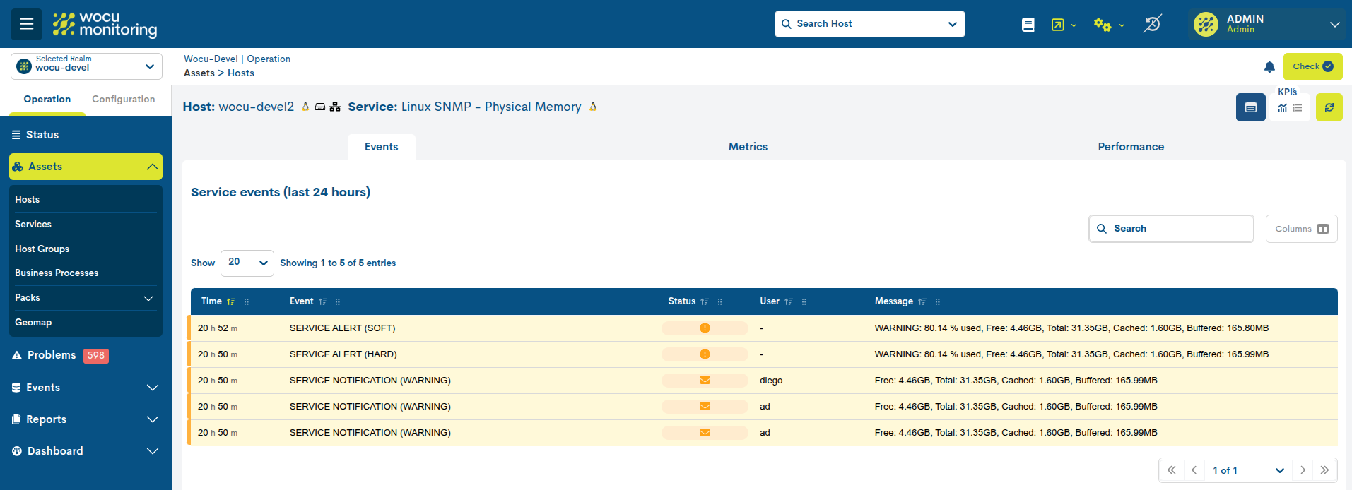
Events
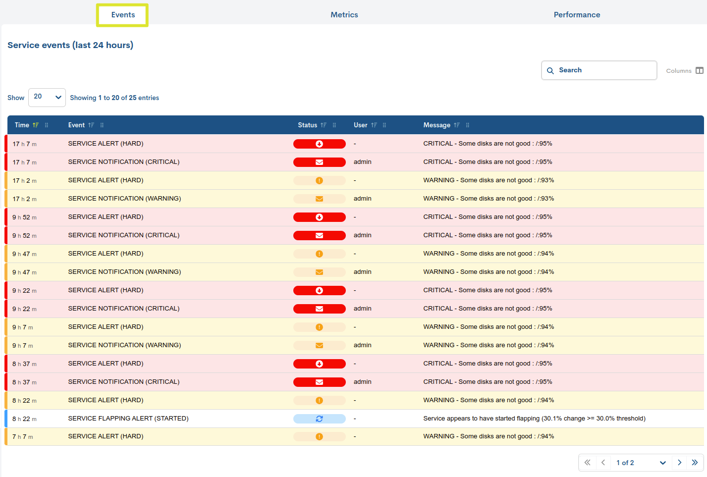
The Events of a particular service are stored and presented in this tab. All monitoring event messages produced in the last 24 hours related to the service in question are displayed.
This listing provides the user with information similar to that offered in the Events section for a specific realm. Therefore, the fields available in this table are explained in detail in the Monitoring Event List Fields section.
Metrics
This view provides accurate information on the evolution and operability of the selected Service, using performance values collected by WOCU-Monitoring and stored in metrics during a check. They are displayed using graphs that show data collected over specific time periods, as well as indicating defined thresholds for Warning and Critical statuses.
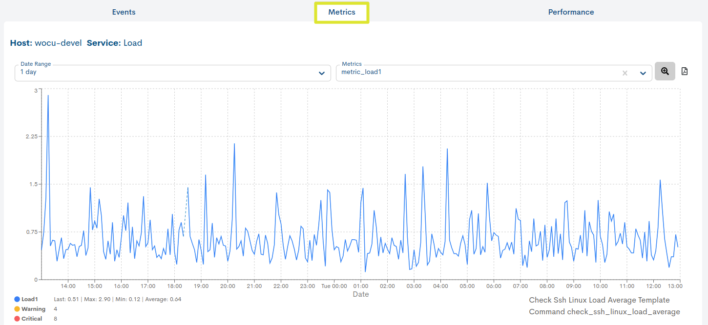
The graph is interactive and allows the following actions:
Selecting a date range for data display
By default it is set to 1 day, but there are other time criteria to choose from, such as: 4 hours, 1 week, 1 month, 1 year and Custom Range.
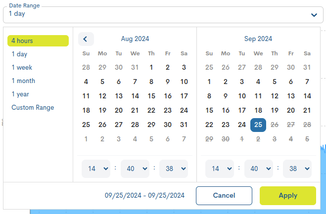
In case you want to set a specific period of time there is the option Custom Range. To configure the time frame it is necessary to set a start date and an end date. By clicking on one of the days, this date will be set as a selection, being marked with a blue background. In addition to the day, a specific time can be set for that day. To do so, use the drop-down menus in the hour, minute and second boxes to set the desired time.
Attention
It is of course not possible to choose start and end dates after the current date, nor to set an end date before the start date.
Selecting the metric whose information you want to display
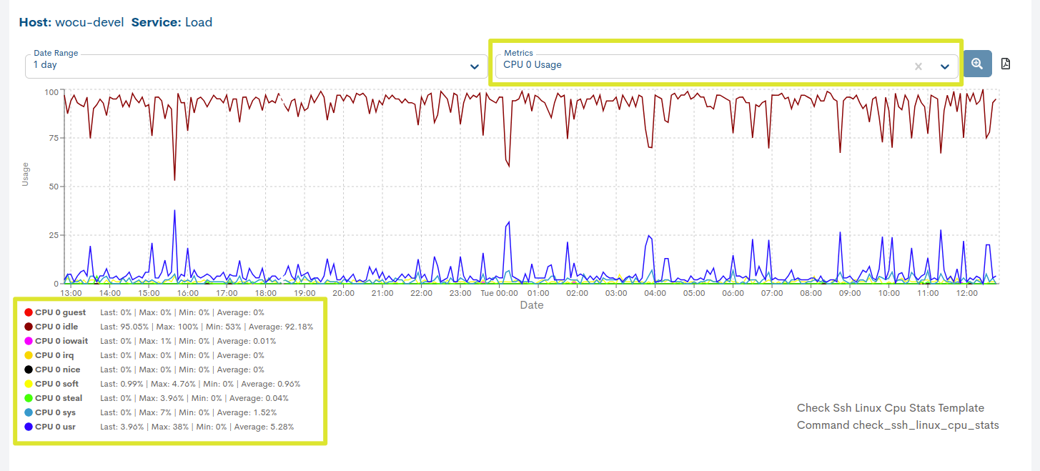
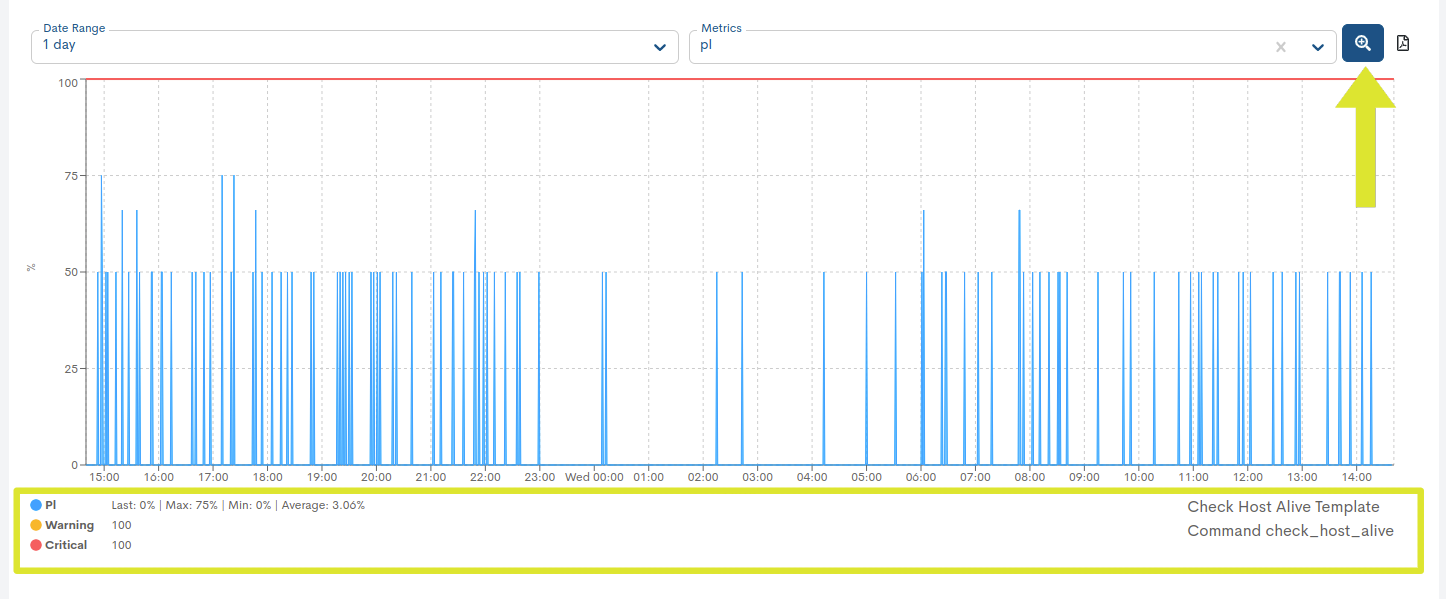
Unlike the fixed metrics of a Host (RTA and PL), in the case of services these will vary depending on the type. See the following example:

Note
Thanks to the Show Critical Reference option (button with a magnifying glass) and the color legend, it is easy to identify the values of both the metric, series or state change thresholds: Warning (yellow color) and Critical (red color). Additionally, along with the legend, the maximum (max), average (avg) and last (last) values recorded are provided.
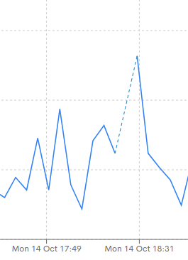
On the other hand, when there were no metric data available for specific points in time, the line will display a dashed line that facilitates the identification of those null spaces.
Monitor all series of a metric in a chart
The captured series of the same metric are represented in a single graph. This facilitates monitoring resources on a broader scale, as it allows comparing and analyzing all series related to a metric in one place.
Dynamic thresholds
This parameter sets the value (in percentage) of the minimum threshold of service level that is considered adequate or acceptable.
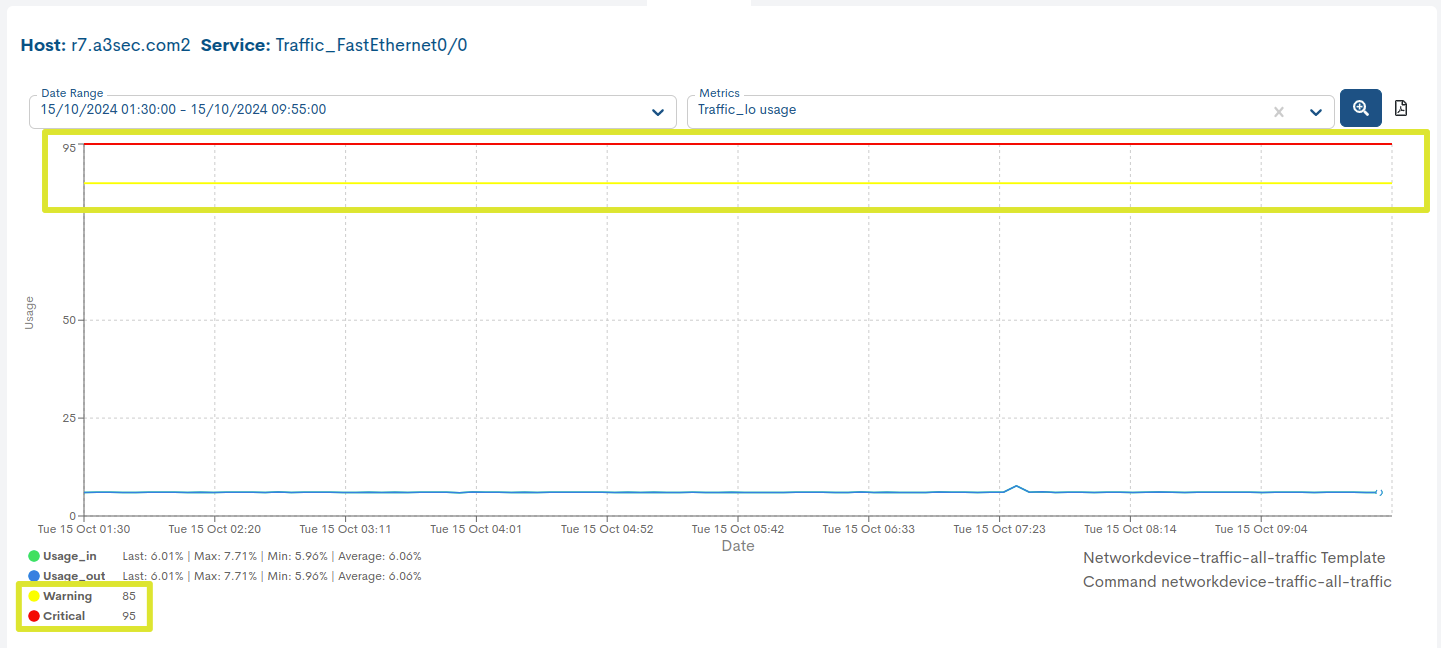
The metric graphs of Services accept Dynamic thresholds, which means that this value is no longer fixed and can be dynamically adjusted within a predefined range. This feature provides greater flexibility and adaptability in managing SLA levels.
In the following graph, you can observe how the Warning and Critical states are now configured with this new function, represented according to the defined ranges for each of them.
Interval selection of a metric in the graph itself
In addition to being able to select (pre-set) time ranges for particular metrics, it is possible to manually select intervals and sub-intervals in the data series and to display a graph of these intervals and sub-intervals.
The selection will be made directly on the graph itself using the mouse. To do this, it is necessary to place the mouse in the area of the generated graph. By clicking and dragging with the left mouse button, a sub-interval within the interval we are visualising will be selected.
Once the range has been selected, we can release the left mouse button, which will result in the graph being updated to show only the defined range.
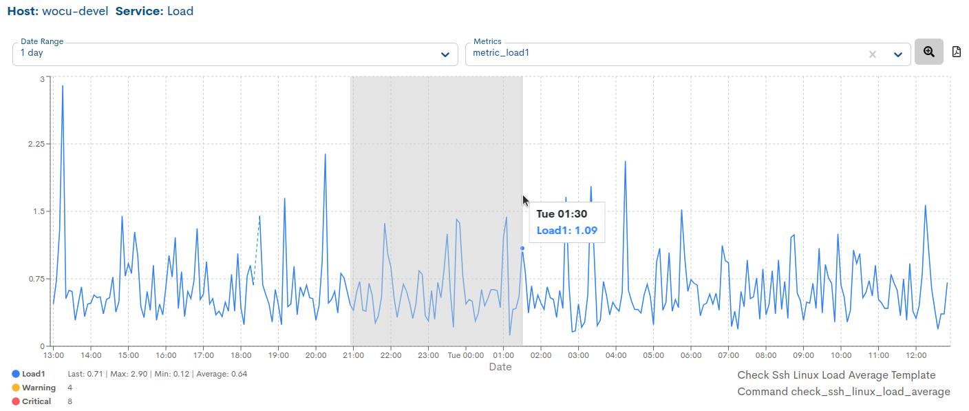
In addition, in the upper date range bar, the time period corresponding to the manual selection applied shall be specified.

To go back to the initial graph (according to the previously chosen range), the filter has to be re-applied and the displayed data will be restored.
Note
This action can be repeated indefinitely, each time obtaining a smaller selected range than the previous one.
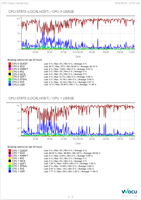
Exporting graphs to PDF
Through the Export button, downloading a report in PDF format containing all the metric graphs of the respective service is facilitated. If the number of graphs is large, they will span across multiple pages.

After clicking on the export button, a file will automatically be initiated to the hard disk for further processing or later use.
BP Trace
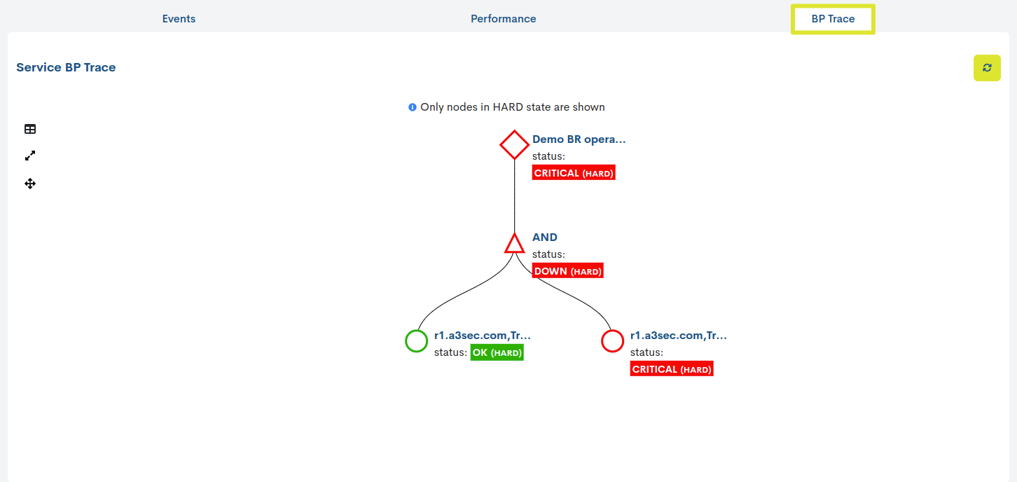
The BP Trace tab, visible only in services belonging to a Business Processes, shows the user a tree traced from the previously defined BP Rule. Thanks to the representation with nodes and logical relationships, in addition to knowing the state of the Business Process, the user will be able to analyse and locate the root cause of an anomalous monitoring state.
Remember
Having established the Business Rule, WOCU-Monitoring will first evaluate the status of each Business Process element. Then, taking into consideration these individual states and the logical operators that link and relate the elements of the Business Process, the system will calculate and determine a state for the Business Process.
On the other hand, the system only considers states of type HARD to determine the overall state of the node. Therefore, any internal changes of type SOFT will be rejected and will not affect the monitoring state calculation.
Important
Go to section BP Trace and get to know this view in detail.
Edit BP Services
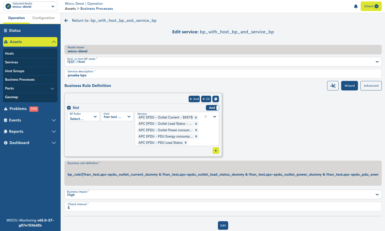
Using the Edit BP Services button located at the top right of the detail view, the user can make changes to the configuration of the BP Service in question.
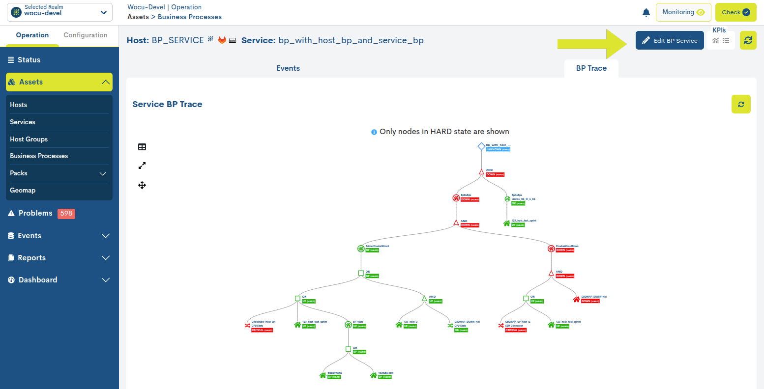
Below is the edit and configuration form for a BP Service. The fields to edit are the same as those described in Add Services Business Process (Add SBP).
Important
The edit action will only be enabled in standard Realms, that is, it will be hidden for Realms based on Host Groups and Multirealms.
Once you have modified the data in the corresponding fields, you must click the blue Edit button to save the settings you have made so far, allowing you to continue editing the form.
Performance
The Performance view collects the monitoring metrics generated after the checks that the service launches on the Appliance on which it depends. Each metric records performance and capacity values, allowing a deeper analysis of the service, and consequently of the Appliance in terms of availability.
Remember
A Pack monitors Host via services, which in turn generate monitoring metrics. The metrics acquire as metric thresholds and ranges, the values of a pack’s configuration macros.
See the following example: The LINUX-SNMP pack, generates the Disk service which after each check gets the monitoring metrics: /run_used_pct, /_used, /boot_used, etc.
The set of values is presented in a tabular format, where an entry is included for each metric, which facilitates their individualised study.

The data are distributed in the following columns, classified in three blocks:

1. Monitoring metrics data:
Name: name of the monitoring metric.
Value: last throughput value recorded in that metric. The system performs automatic value conversions, transforming units to more practical and readable ones (e.g. from bps to Kbps, or from ms to s) and without performing manual conversions, as the values are presented converted by default.
This means that in the same cell of the Value column, different units can appear at different times. This is because the system will assign the most appropriate unit depending on the value recorded. For example, a metric may be displayed in Kbps one day and in Mbps another, if there has been a higher usage of the resource. This adaptation is dynamic and automatic.
2. Measurement thresholds:
Minimum: defined minimum threshold that the metric can reach. It is identified by a green vertical line positioned (normally) at the beginning of the bar. If the metric value recorded is below the threshold, the minimum bar will be moved to the far right.
Warning: defined threshold above which the metric will reach a warning or alarm state. It is identified by a vertical orange line.
Critical: defined threshold above which the metric will reach a critical state. It is identified by a vertical red line.
Maximum: maximum defined threshold that the metric can reach. It is identified by a vertical black line positioned (normally) at the end of the bar.
Attention
Metric thresholds are defined or modified in the configuration of the Monitoring Pack in a generic way, by configuring specific macros. The system will use the default values in the pack when they have not been added by the user.
3. Graphing the metric:
Graph: the current value of the metric (column Value) is represented graphically by a rectangular bar of length proportional to the recorded value. As can be seen, there will be a graph for each of the metrics of the monitoring service.
Its behaviour is very simple: when the bar advances and exceeds the established threshold, the colour will change according to the margin reached.
Thresholds act as indicators and are represented by vertical lines along the bar. Each threshold has an identifying colour associated with it.

The colour distinction is as follows:
Light grey colour: indicates the absence of metric data (value = 0).

Dark grey colour: indicates that the value is lower than the set minimum.

Blue colour: indicates the existence of a recorded value but no alert thresholds. This situation generates some uncertainty about the actual status of the metric.

Green colour: indicates that the value is above the minimum value and below the warning thresholds.

Orange colour: indicates that the value is above the WARNING threshold but does not exceed the upper thresholds.

Red colour: indicates that the value is above the CRITICAL threshold or higher.

